Lifestyle
St. Jude Affiliate Clinic at Mercy
The design of the St. Jude Affiliate Clinic at Mercy Children’s Hospital in Springfield welcomes children and their families with open arms
By Ettie Berneking | Photo by Brian Kubik
Sep 2014

As construction continues on Mercy’s new children’s hospital, the St. Jude Affiliate Clinic housed within the Jane Pitt Pediatric Cancer Center on the first floor opened for business last May.
Plans for the St. Jude Clinic started in 2011 when the team of doctors and nurses who were busy helping their young patients fight their way back to being cancer-free started making a wish list for a brand new facility.
Back then, the children’s cancer wing was a typical hospital setup. A nurse’s desk doubled as the waiting room, and rows of treatment rooms housed kids and their families. It didn’t take long for the medical team to recognize that changes needed to be made. The old setup wasn’t the kind of cheerful environment these youngsters and needed. It was cold, sterile and gloomy.
In an effort to change things, a team of Mercy administrators, nurses, architects and planners toured Cardinal Glennon Children’s Hospital in St. Louis and St. Jude Children’s Research Hospital in Memphis.
The team returned to Springfield with a list of ideas for Mercy’s new children’s cancer center. There were long talks between the nurses and the planners about bringing in bikes for the kids to ride, the importance of line of sight, how to keep rooms as sterile as possible, ways to lighten the atmosphere and much more. “Honestly, I really dreaded going on that trip,” says Stephanie Bailey, the practice manager at the St. Jude affiliate clinic. “I thought it would be too depressing, but it wasn’t. It was uplifting.”
After months of planning and getting feedback from parents and patients about what they would like to have in the facility, the final product hardly resembles the rest of the hospital. The walls are colorful, with pictures of flowers and frogs that greet kids and their families. There’s a living room setup with TVs, video games and everything a kid could want. Instead of creating a hospital, the nurses, planners and architects behind this project created a space where kids can be kids and forget, even if it’s just for a little while, about the cancer they’re battling.

Work Space
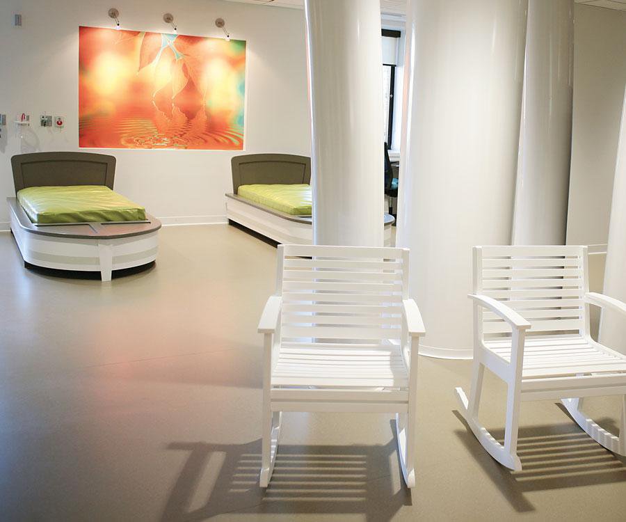
When architect Brian Kubik started work on the St. Jude Affiliate Clinic at Mercy Hospital in Springfield, he had an especially unique tie to the project. Kubik’s son, Cross, had battled cancer, and Kubik and his family had spent a whole year actually living at St. Jude Children’s Research Hospital in Memphis. Kubik was able to bring a parent’s perspective to the project and suggested creating a work space where parents could set up laptops and get work done while their kids were getting treatment, something that wasn’t available in Memphis. The boat beds were another addition to the work area, so kids and their families could relax in a comfortable space that was also medically safe.

The Teen Room
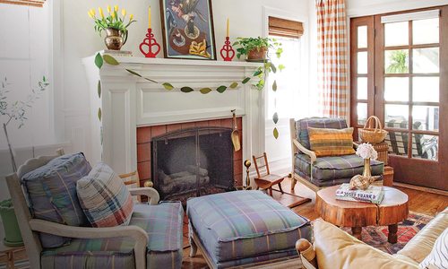
The team wanted to create areas where kids of all ages could feel comfortable. The teen room is the perfect spot for older kids to get some time away from the youngsters, and the family room is the ideal spot for the whole family to unwind and play games. The family room was an idea architect Brian Kubik brought to the table. Cheryl Doran, a member of the Mercy planning, design and construction team who led the project, heard from parents that they wanted a space that felt like home, so Kubik decided to create a space modeled after the Grizzly House in Memphis where he and his family stayed while his son Cross was receiving treatment. “The Memphis Grizzly House was on the hospital campus and was a place where families could live,” he explains. “There was a family room there, so we spent a lot of time there. ”

Colorful Walls
Everyone agreed that bright, welcoming colors were a must. “When a kid is sick, they want to stay in their room,” Doran says. “But they won’t get that social time that’s so good for therapy. So in order to get them out of the treatment rooms and out with the other kids, we painted the rooms white.” The rest of the clinic is coated in bright blues and greens, and interactive games and activities are spread throughout.

Line of Sight
When designing the center’s layout, it was important to create an open line of sight so nurses could see the patients at all times. “There are no walls that are barriers,” says Doran. The walls that are up are clear, so patients can feel like they can get away while still being under the watchful eye of a nurse.

Space Planning
As the nurses and planners worked together on the planning of the clinic, they had to come up with a way to keep the kids and their families secure in the clinic while still making the clinic accessible to other hospital staff including the laundry service. The main concern was coming up with a way to prevent the spread of bacteria and disease. The solution is a series of hallways (below) that connect the clinic to the rest of the children’s hospital but that don’t lead into the clinic’s main room where the children are playing.


