Spaces

Colby Kern’s Monochromatic Urban Loft

Colby Kern and Clay Stacy’s loft in downtown Springfield is a testament to the power of good bones, an eye for the unexpected and, perhaps most importantly, a “ruthless” curation style.

By Lillian Stone

Oct 2017
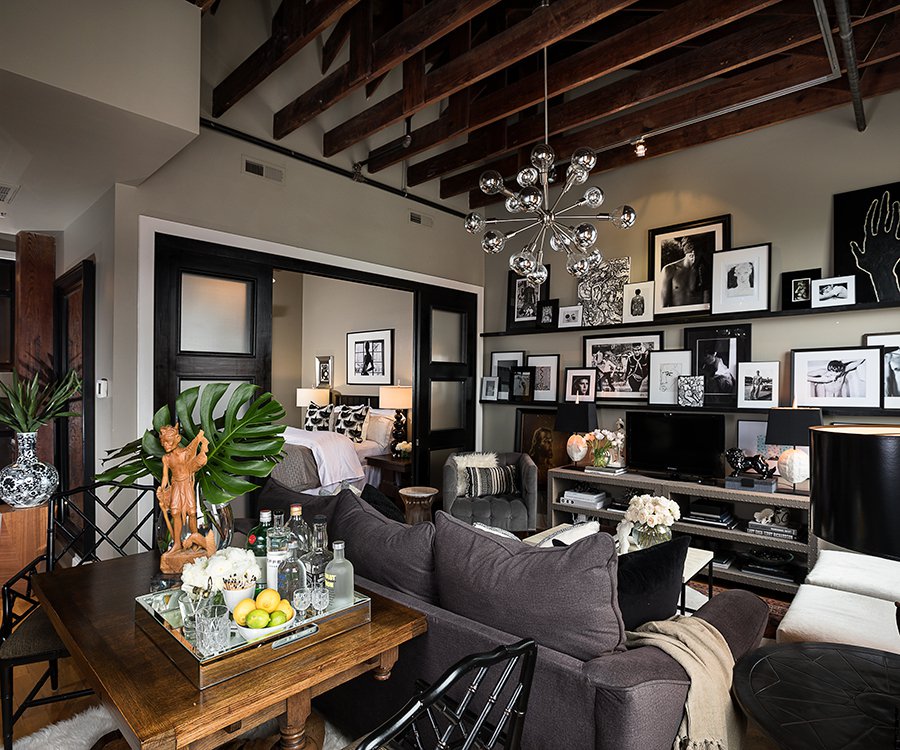
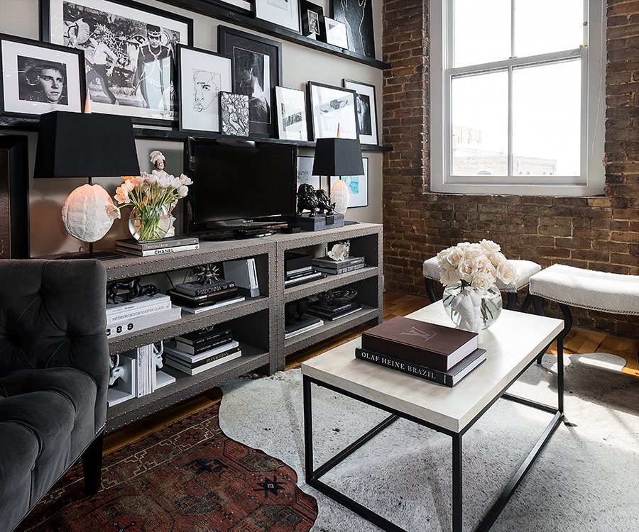
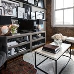
Photo by Brandon AlmsColby Kern and Clay Stacy’s living room is undeniably the most captivating space in the loft, highlighting Kern’s collection of coffee table books and eclectic art. Several of Kern’s photographs are featured here, along with pieces by friends and Kern’s two nieces, Addison and Alia.

Colby Kern sits cross-legged in a high backed chair in his loft’s living area. He strokes his 10-year-old Chihuahua-pug mix, Beanie, whose heavy breathing lends a comic air to Kern’s brooding nature. “I’m a very controlled person,” Kern says. “I have a very ruthless curation style, and that’s in all aspects of my life.”

We’re discussing the inspiration behind Kern’s sophisticated loft in downtown Springfield. The loft, which Kern shares with partner Clay Stacy, overflows with expertly curated art, one-of-a-kind furnishings and the occasional well-placed antique. It’s a testament to Kern’s creativity and flair for the unexpected—factors that serve him in his job as the lead visual merchandiser for Obelisk Home. The loft is one of seven luxury spaces that make up the Lofts at Inspired Commerce located above Obelisk Home. Originally, Kern wasn’t interested in living so close to work. The building, built in 1902 and featuring original exposed brick and ceiling rafters, won him over. “I love the light and the high ceilings,” Kern says. “Beyond what’s in the space, you have to have good bones to make it look good.”

The loft does have good bones—that’s undeniable. The interior design, however, is truly captivating. Between Kern’s large collection of art and lush furnishings, the loft has very little negative space. However, none of the pieces feel superfluous. “There’s nothing in here that I don’t absolutely love,” says Kern, who refuses to settle on pieces that are less than spectacular. “I see a lot of people who settle,” he says. “They’ll buy something just in the meantime to fill a space. I don’t have a problem waiting to find that perfect item.”

The neutral, moody color scheme in the art and furnishings speaks to Kern’s disciplined design principles, featuring mainly black and white elements. Many of the framed black-and-white pieces on the loft’s walls are photographs captured by Kern himself. “I’m very interested in form,” says Kern, whose edgy photographs showcase the masculine form in a sensual, sophisticated way.

That sexy masculine energy is a motif in the entire loft. The furnishings range from high-end, like the Staffordshire porcelain figure in the living room, to homegrown, like the framed portraits of Kern and Stacy drawn by Kern’s two nieces. Despite the eclectic collection of art and furnishings, the space is far from overwhelming or gaudy. It feels sleek, clean and inviting—clearly put together by a design expert. 

Part of that expertise may be the result of Kern’s work with Obelisk Home. For some, hours spent designing spaces may require nightly recharging sessions. Kern, however, often feels inspired to update his own space after completing a project. “I do [design work] all day at work, and you’d think it would be nice to have a break,” he says. “But I just get more inspired afterward.”

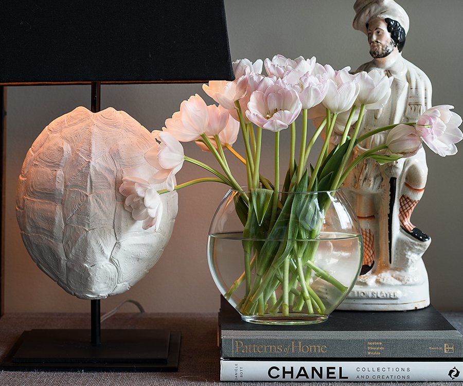
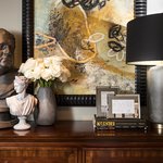
Photo by Brandon AlmsThis Staffordshire porcelain piece, entitled “Lion Slayer,” is the oldest piece in the space, dating back to circa 1870. Kern found it at the Antique & Design Center in High Point, North Carolina, where he was attending the furniture market. According to Kern, this piece is the perfect start to the Staffordshire collection that he hopes to grow.
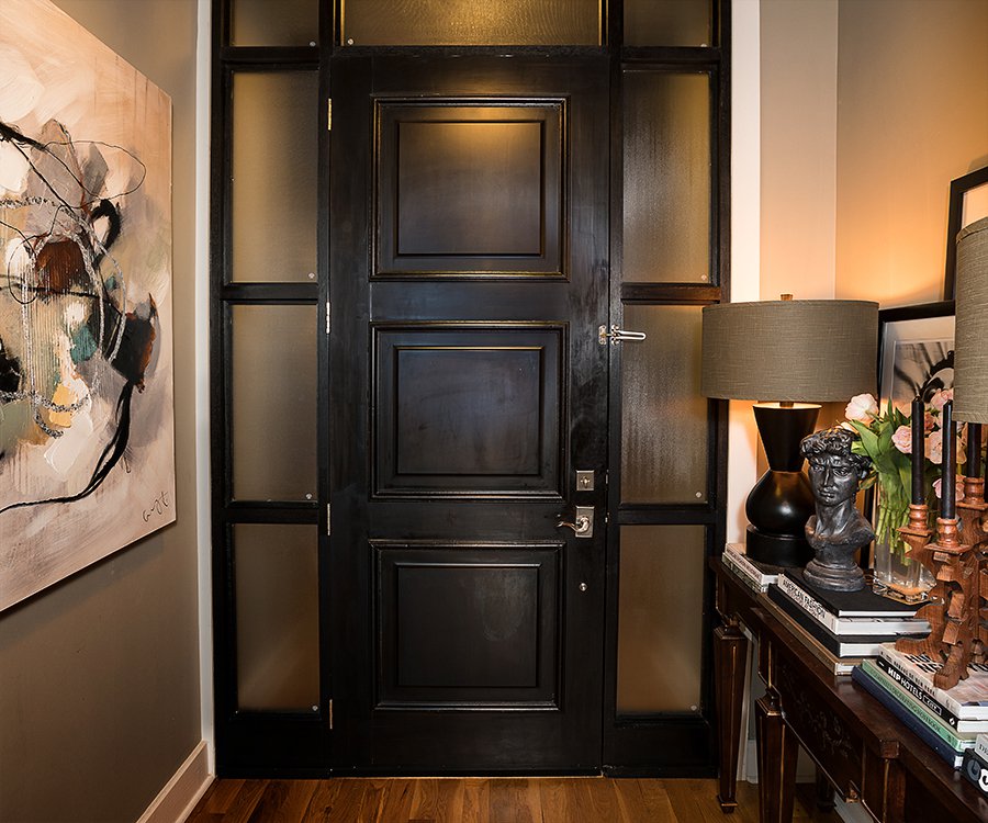
Photo by Brandon AlmsA print from Colby Kern and Clay Stacy’s trip to Eureka Springs hangs in the loft’s entryway. Atop a desk opposite the painting rest a few of Kern’s 50 to 60 coffee table books.
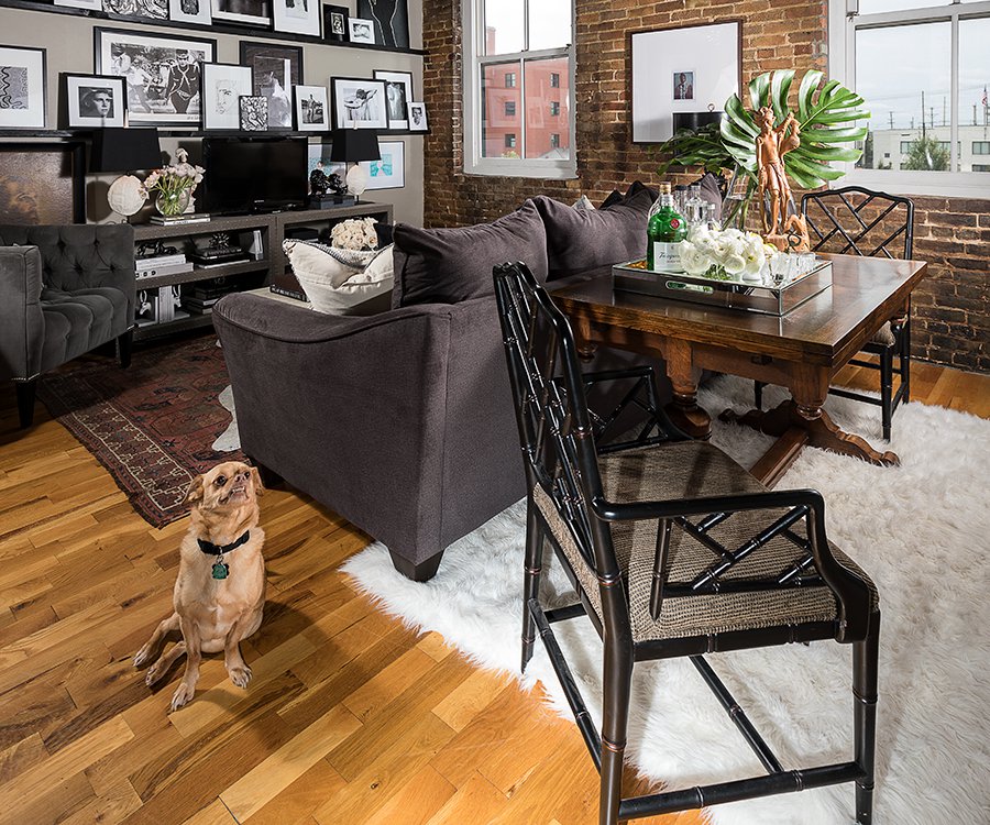
Photo by Brandon AlmsEach of the Lofts at Inspired Commerce is unique, which is one factor that drew Kern and Stacy to the historic space. The building was built in 1902, and the original brick and ceiling rafters are well-maintained.
Photo by Brandon AlmsStacy explains that the living room is his favorite area in the loft because of “the detail and focus that’s put into it.” Kern’s ruthless curation is especially apparent in this room, which manages to burst with edgy patterns and art while still feeling sleek and, admittedly, very sexy. “There’s not a single item in this space that doesn’t belong,” Kern says.
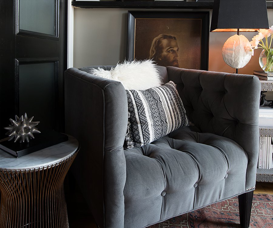
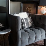
Photo by Brandon AlmsThe living room is covered in luxurious fabrics and prints, which contrast beautifully with heavy metal accents. The gallery wall is filled with black-and-white art—mainly portraits—featuring diverse subject matter. It all works together to tell a powerful story.
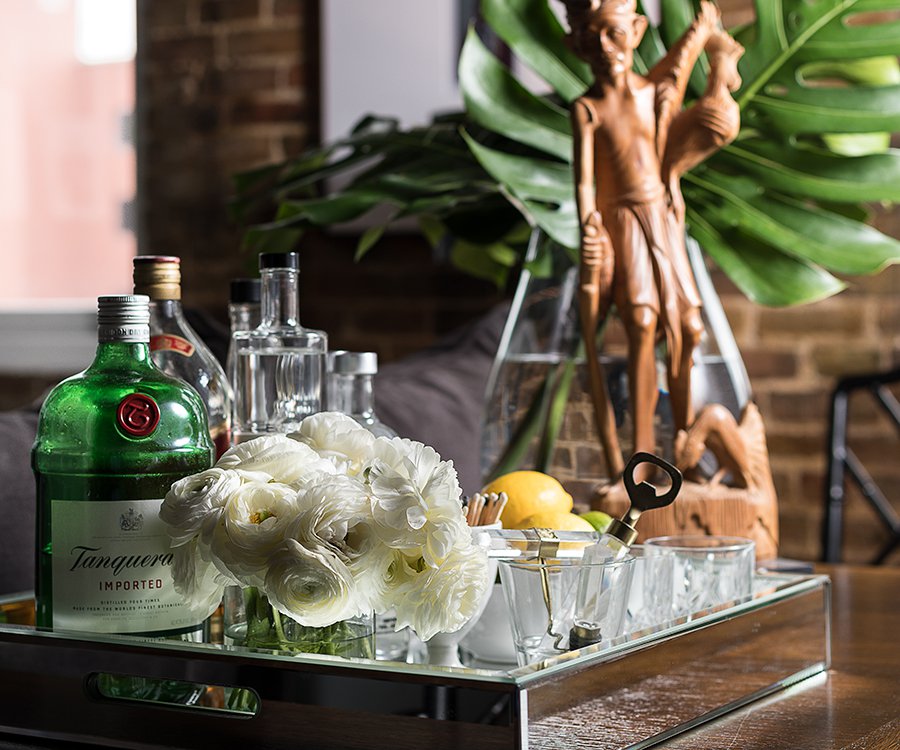
Photo by Brandon AlmsThe antique dining table behind the sofa is the definition of multi-purpose. When it’s not being pulled out for dinner parties, the table is often adorned with fresh flowers and this bar tray, which is perfect for entertaining guests or unwinding at home
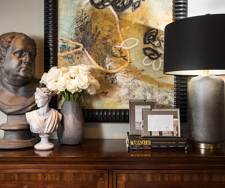
Photo by Brandon Alms“I love to tell little stories with little vignettes,” Kern says. The apartment is full of perfectly styled scenes like this one, which combines the starkly architectural appeal of classic busts with abstract touches, framed art by Kern’s nieces and, naturally, another stack of coffee table books.
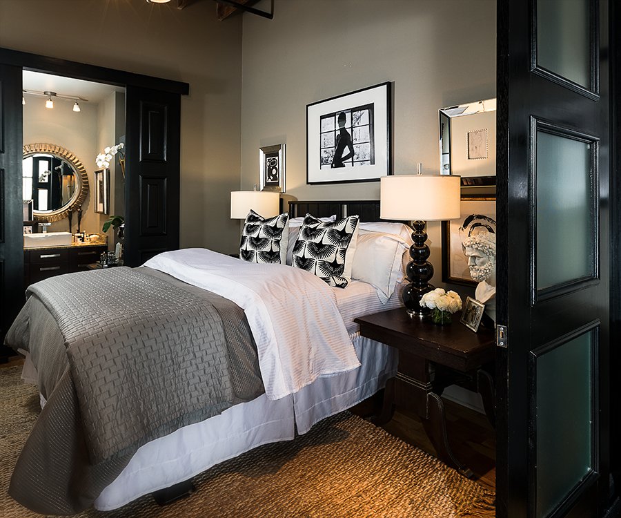
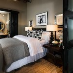
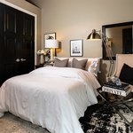
Photo by Brandon AlmsThe master bedroom’s neutral hues are calming and elegant—not to be mistaken for boring. “It’s a good mixture of old and new,” says Kern, who is particularly proud of the iconic Barbara Cosgrove gourd lamps that adorn the bedside tables.
Photo by Brandon AlmsThe master bathroom manages to pack a lot of style into a relatively small space. The horn sconce light fixture was designed for Barbara Cosgrove by J. Kent Martin. The mirror is another J. Kent Martin Design.
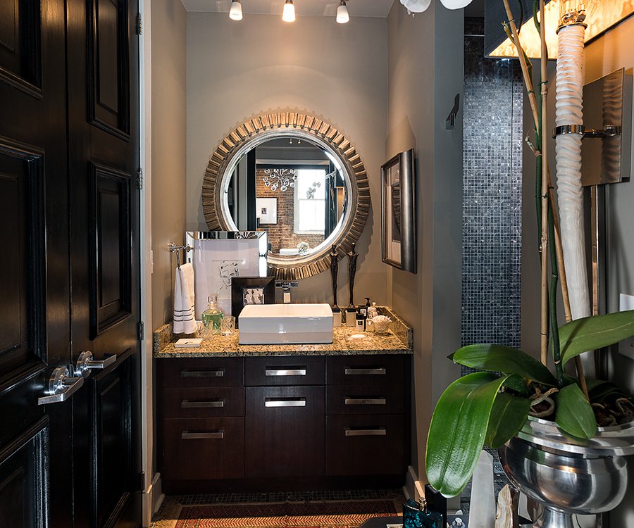
Photo by Brandon AlmsKern placed a vintage typewriter cart to the left of the vanity in the guest bathroom for additional counter space. The photographs adjacent to the mirror are a vertical triptych taken by Kern. Like much of his work, they feature the nude male form.
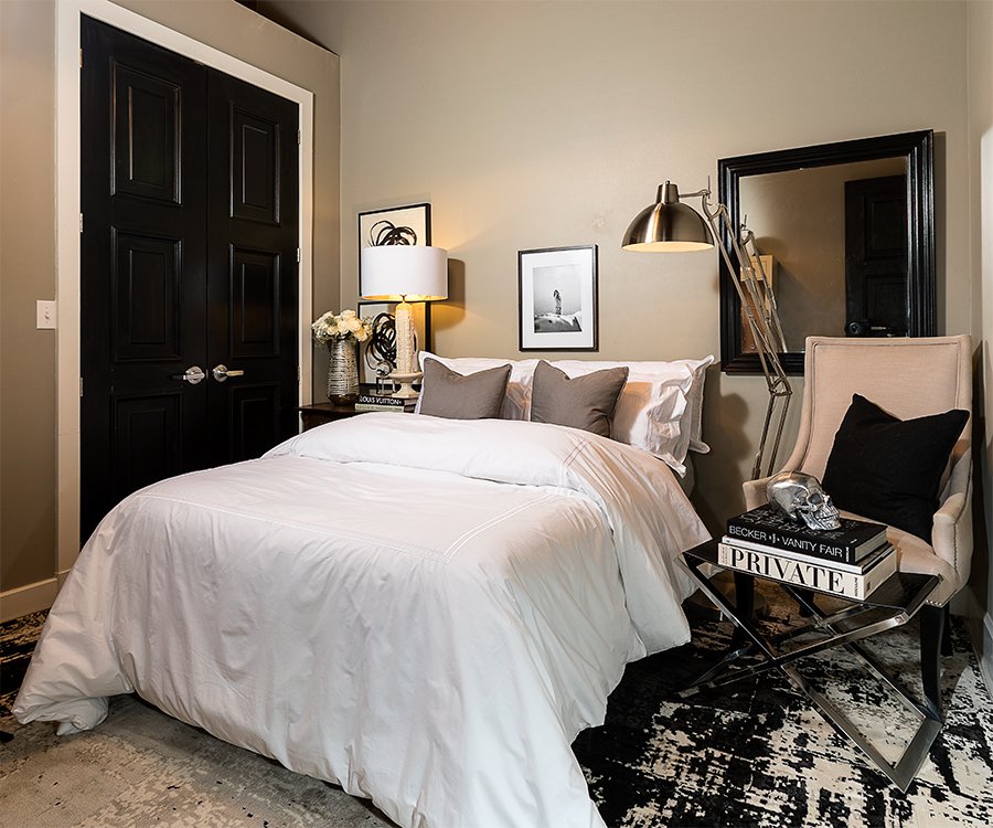
Photo by Brandon AlmsThe plush guest bedroom is just as intentional as the rest of the space. “We have friends and family stay with us from out of town often,” Kern says. “I wanted them to feel like they were at a hotel.” According to Kern, it’s also Beanie’s favorite napping spot.
Photo by Brandon AlmsAlthough Kern doesn’t spend much time in the kitchen, he loves the generous storage space and the lighting. “We put the above-cabinet lighting in ourselves to add even more moodiness,” he says, pointing out that the additional lighting highlights the original brick.
Slider Thumbnail:
Slider Thumbnail:
Slider Thumbnail:
Slider Thumbnail:
Slider Thumbnail:
Slider Thumbnail:
Slider Thumbnail:
Slider Thumbnail:
Slider Thumbnail:
Slider Thumbnail:
Slider Thumbnail:
Slider Thumbnail:
Business Listings: