Spaces
Karma Salon's Remodeled Space
Karma Salon celebrated 10 years in business in 2016, and their remodeled space was a gift to themselves—and all of Springfield.
Written by Rose Marthis | Photos by brandon Alms
Oct 2016
Entrance
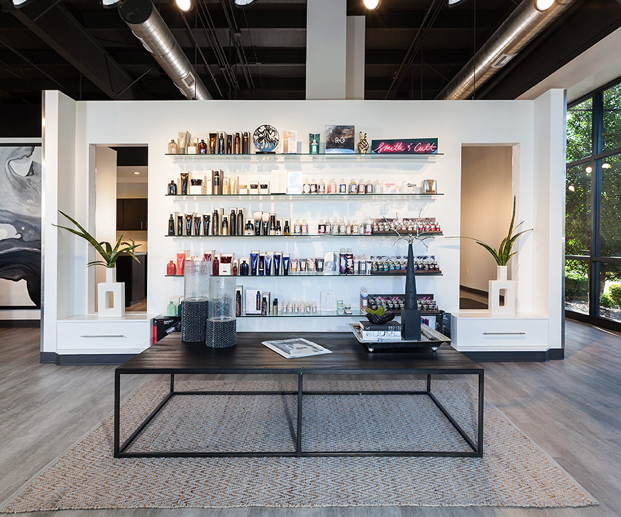
Just to the right of the reception desk is the retail area with a wall of products available to customers. The new space also means new luxury brands added to Karma's retail selection. Oribe, R+Co and Smith & Cult all joined the shelves, which Christy loves. The modern cutouts framing the space add to the open feel and let customers and stylists interact while browsing for products to take home.
In 2006, Star Wars only had six episodes, everyone was wearing skinny jeans, and workouts moved indoors with the release of Wii Sports. In our neck of the woods, Karma Salon was opening its doors on South Kimbrough Avenue in October. During the past decade, Karma has grown to a top salon in Springfield as local lovers of hair color spread the word with #colormekarma. To ring in their tenth year, owners Christy and Ryan Boyle started talking about renovating the space last fall. In May of this year, the salon welcomed newcomers and loyal customers alike to a new, modern space that had doubled in size.
Before the renovation, the salon had 10 stations, a color bar with shampoo chairs coming off of it, a dryer area, a seating area and a retail product area. One of the biggest goals for the new space was to make it more functional. The old salon was cramped, especially in the color bar and shampoo area with only one point of entry. Christy knew that had to be changed, and wanted to add more space for storage and functionality throughout the salon. The Boyles debated moving to a new space in Springfield, but decided to grow where they were planted and keep the location that everyone knew and loved for the salon. But the salon still needed to be bigger. So they worked with Magers Management Company, LLC to buy the floor space next door, and added an additional 1,350 square feet. Christy loved adding an exterior wall with more windows and now had the room to work with to make her vision for the new salon come to life.
It was important to Christy to make it look like a cohesive space and not two separate units. She worked with Haden Long of Ellecor Design & Gifts, who happened to be one of Ryan’s clients, to help translate her ideas to paper. “I knew what I wanted, but I needed someone who knew what she was doing to help me put it to scale,” Christy says. They came up with a floor plan, and Christy took it to Magers and made it a reality with help from Slone Architects. Demolition started at the end of January, and the final inspection was March 31.
To create more stations, the team mimicked the left side of the salon on the right side for cohesiveness. One of the biggest changes was the color bar—Christy came up with the idea for a galley-style bar with four points of entry and an island. The shampoo chairs were moved to the back wall as well, allowing even more space to breathe and adding privacy for clients for a more relaxing experience. They also created a separate reception and waiting area, a retail area and a selfie station near the front of the building, and added an office, extra services room and a storage room in the back.
For the interior design of the expanded space, Christy had been gathering inspiration for the new look she wanted for months, and ultimately decided to make the decisions herself rather than hiring a designer. The inspiration stemmed from a black-and-white watercolor mural Christy found. That monochromatic scheme was carried over throughout the entire newly designed salon and was incorporated into the new branding and logo. Christy likes the neutral base because it allows the people and products inside to be the pops of color, she says. “Ultimately, I wanted to create a space that was different than anything here,” she says. “I wanted to create a space that felt creative for our stylists and creative for our guests.”


Reception and Waiting Area
The black and white watercolor mural behind the front desk was the inspiration for all the new branding and design Christy wanted in the space. She found a mural she loved, but couldn’t order it, so she enlisted the help of local artist Corey Donnell to create a watercolor mural that fit the space perfectly. This mural then became the backdrop for business cards, flyers and other marketing materials for the salon, which Modern Crayon Design created. The wall also serves as a barrier between the reception area and the color bar and stylist stations. The furniture was ordered from various upscale furniture stores, and Christy purchased accessories at 5908 Interiors, keeping much of the renovation local.

Stylist Stations
The left side of the salon mostly stayed the same and served as inspiration for the added space on the right side. The stylist stations were mirrored across the salon to create the cohesive feel that was so important to Christy. They added new mirrors, styling chairs and stations to create a space the stylists love. It allows them to interact and all say it really makes it feel like one big family.

Hair Washing Wall
One of the biggest changes in the salon was moving the shampoo bowls away from the color bar. Christy moved them to the back wall of the salon to create a more relaxing experience with added privacy. She also invested in super-comfortable chairs that relieve the usual strain on your neck. No detail was left out, as evidenced by the K-shaped shelves above the washing stations. The Coco Chanel quote wall that reads, “Beauty begins the moment you decide to be yourself,” is Christy’s favorite wall. “I just love how it ties into what we do,” she says. Her graphic designer, Andrea Kirchhoefer with Modern Crayon, helped get the look of it right, using the black and white mural as inspiration.

Selfie Station
When planning the new space, Christy knew she wanted to add an area for clients and stylists to take photos of their new look. The frame was designed using the same elements as the other branding materials, and Christy says people really love it. Fun fact: The light used for the photos is the same light Kylie Jenner uses for her fabulous snaps, Christy says.

Drying Area
The huge DRY. decal was one of the few items saved from the old salon and moved to the new location of the dryers along the back wall. Christy says she loves that it defines the space in a big way. The drying area was important to her, and she wanted to create a comfortable area for clients to process, have a drink, charge their devices and simply relax.

Bathroom Painting
Christy says she loves to have one detail that’s unexpected. In the salon, that comes in the form of the pop art painting in the bathroom. The rest of the room is black and white like the surrounding salon, so Christy added an uber-bright painting for a fun surprise. “I like the pop of wild color in there because there’s nothing else like it in the salon,” she says.

Color Bar
A huge part of Karma’s brand is its hashtag, #colormekarma. Christy wanted to pay homage to that with a sign above the color bar, another favorite spot of the stylists. Stylists and clients are encouraged to use the hashtag in all their posts as a way to celebrate and show off their work, and it allows potential customers to see what Karma stylists can do.

Exterior
There was a lot of discussion about moving when Karma’s 10-year lease was up this month, but Christy ultimately decided to stay in the same location on South Kimbrough Avenue. But the exterior wasn’t left out of the remodel, as Christy had a brand-new sign installed to show off the redesigned logo. Deciding to change the logo was a big decision for Christy, but she wanted their logo to fit the new look of the salon.


