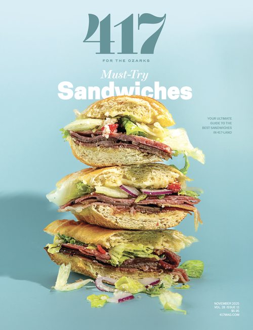
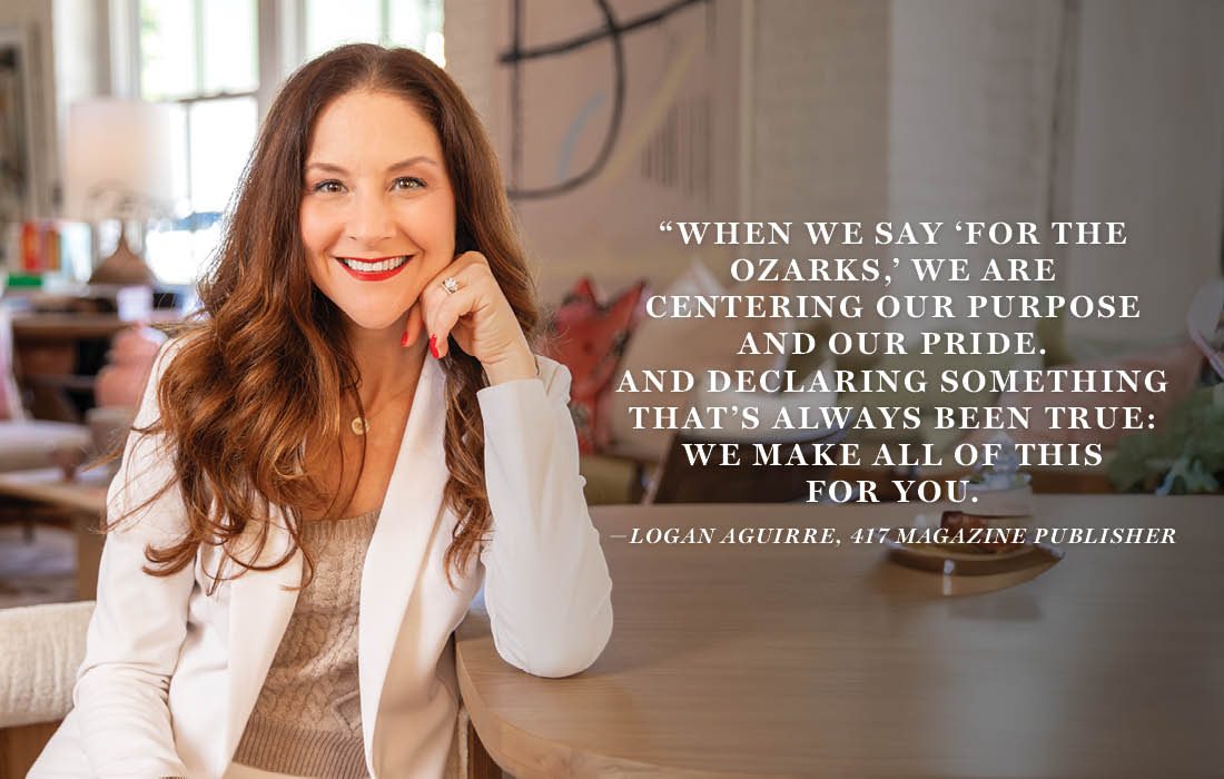
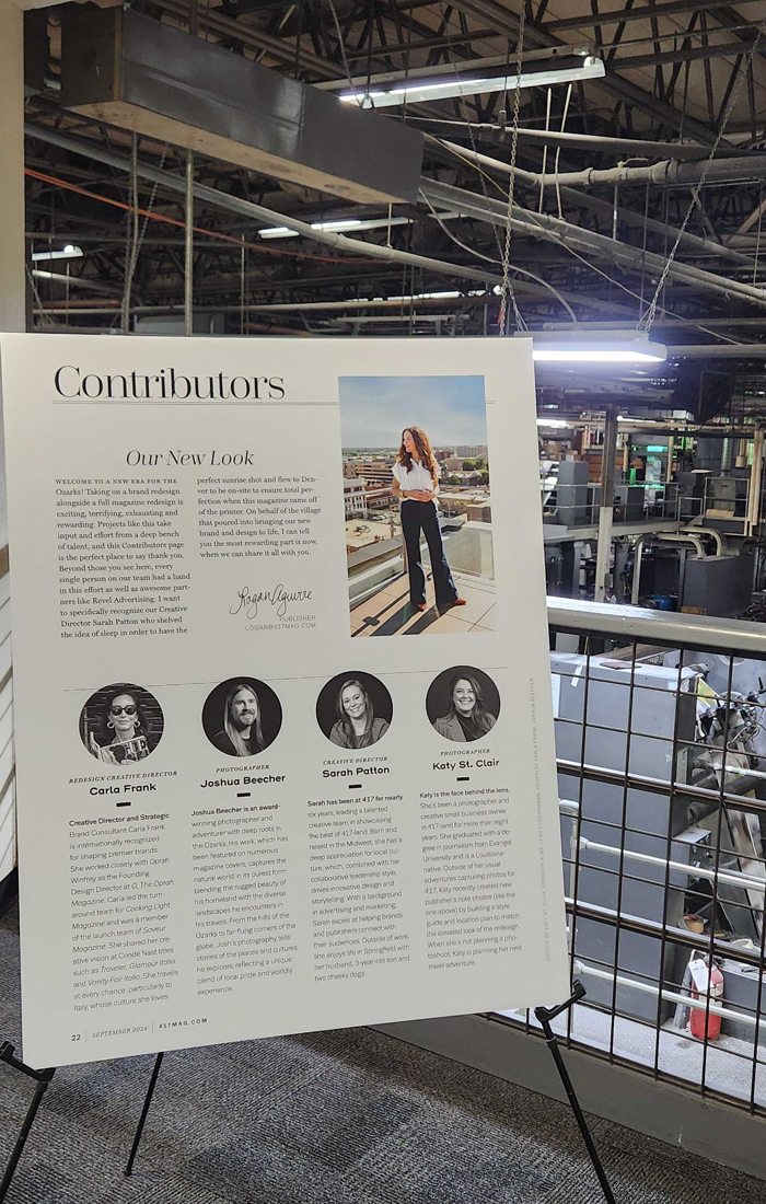
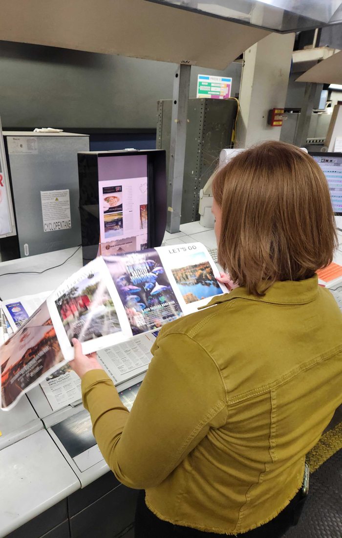
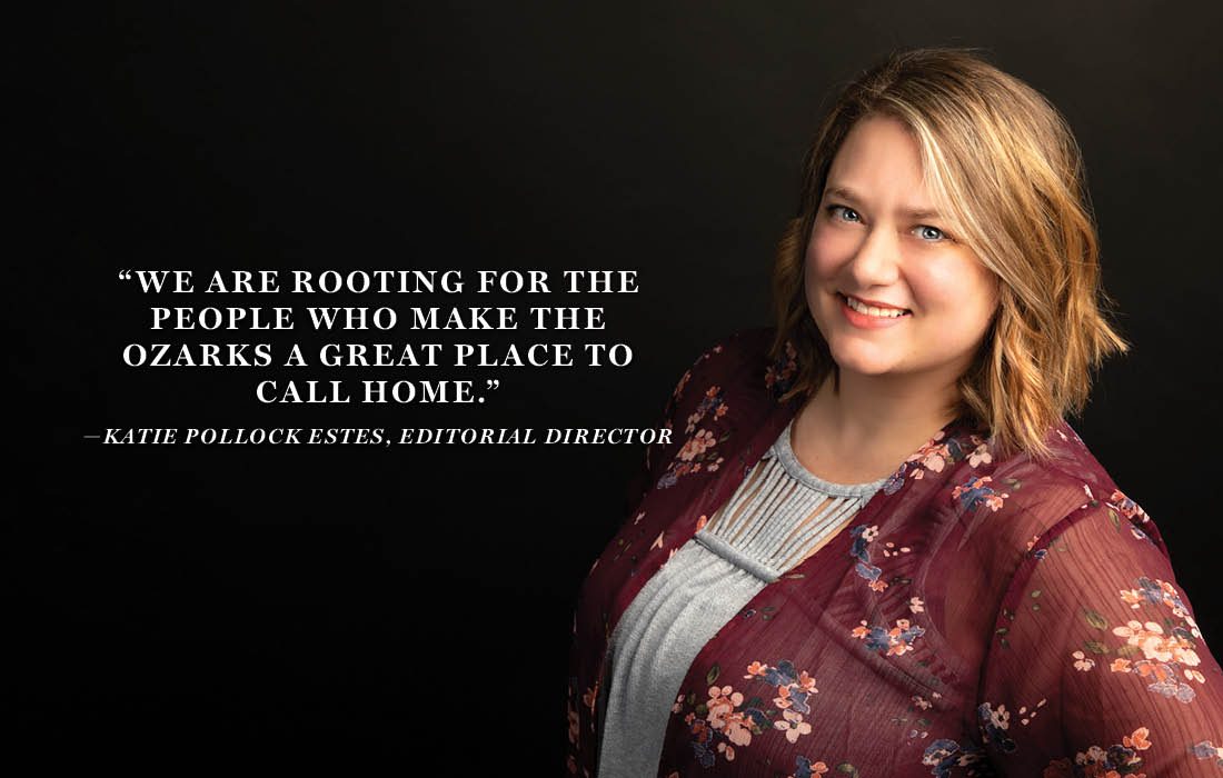
At 417, we are excited to tell you what we’ve been working on over the past year. Last fall our owner and publisher Logan Aguirre made a commitment to refresh and elevate the reader experience for our audience and with it, a redefined brand promise. To redefine our brand promise, we had to start with why. Why do we do this? The answer is simple. We do it for the Ozarks. And thus, our refreshed brand promise was born.
At 417, we’re for the Ozarks.
This month, we finally get to share it with all of you.
Key updates include:
Updated Logo: Our logo and look both feel more current. The original 417 logo dates to 1998. Sure, the ’90s are back, but in this case we’re moving on.
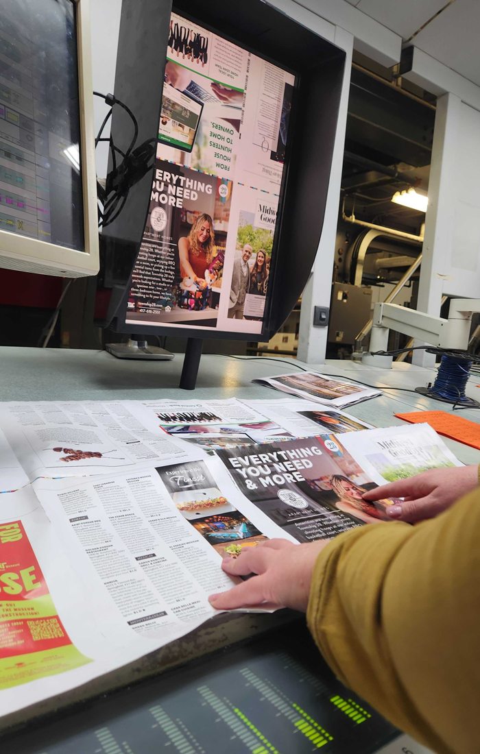
Easier to Read: A more enjoyable reading experience with intentional layout and design changes, more white space and room for content to breathe.
Everything Ozarks: Even more local love for what makes our region great.
Everywhere You Are: In the magazine, online and with you in the community.
More Home Content: We’re debuting an entire “At Home” section in each issue of 417 to expand our home and design content.

