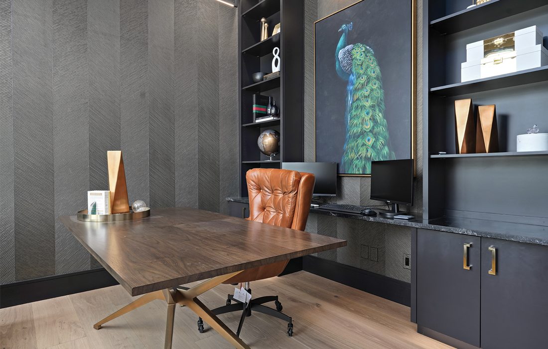
A home office should never be boring. To inspire creativity and purpose, interior designer Chelsee Sowder used opulent touches and warm organic materials to elevate the work of two busy professionals. “We like to curate an entire room from start to finish, so we know from the beginning everything that will be in a finished space,” says Sowder. “This home office and its statement artwork are no exception.”
Homes of the Year
Homes of the Year 2023
Take a look at the winners of our 2023 Homes of the Year.
by Ren Bishop
Dec 2023

Elevated style, perfected. After years of chaos in the construction industry, this year’s best homes show an unprecedented level of intentionality. Hidden kitchens, in-home social clubs, a pool and so many delightful design details make these swoon-worthy spaces truly spectacular. Each year, we invite southwest Missouri's architects, home designers and builders to submit their best spaces for this Best of the Best list. Then, we recruit members of a Home Builders Association outside of our region to pick their favorites within five categories. You’ll see why these homes truly are the 2023 Homes of the Year.
Jump to a category
$2,000,000 or More
Coastal Inspiration
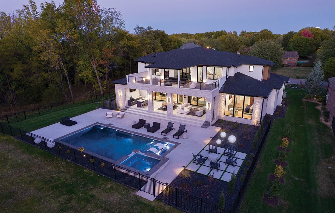
Inspired by the coastal luxury of Naples, Florida, this home features 10,000 square feet of indoor/outdoor living with three levels of exceptional entertaining spaces and elevated design details.
Interior Designer
Chelsee Sowder, Lead Designer of Chelsee Sowder Interior Design
Builder
Jeremy Eck, Builder of Eck Group Building & Development LLC
Home Designer
Casey Ennis, Architectural Designer and Owner of Dale Peer Home Design
In search of inspiration, a Christian County couple flew to Naples, Florida. to tour homes and find their style years ago. The homeowners wanted a Coastal Contemporary home that would become a true oasis for their family of five.
“I had a dream in my head, and it took a while to articulate that vision, both within the floor plans and the exterior facade,” the homeowner says. “Jeremy and Chelsee helped make my dreams become a real home.”
Now standing tall on a corner lot, this home of the year is a sanctuary for a busy family and the destination for family gatherings. An open concept main floor features living, dining and kitchen both inside and out, illuminated by custom light fixtures designed by the team at Chelsee Sowder Interior Design and softened by wood details strategically placed for visual impact.
In every nook, there’s both function and form for this family curated every step of the way.
“The indoor/outdoor integration of living is the most functional element of the home,” says Chelsee Sowder, interior designer. “The living room and kitchen both have Anderson MultiGlide sliding door systems that disappear into hidden pockets within the walls, creating a cohesive integration on the main level from inside to outside. They flow seamlessly into each other. The pool, spa, fire pit and patios are integrated into the outdoor living space, making this a place you wouldn’t want to leave. That’s precisely what the homeowners wanted.”
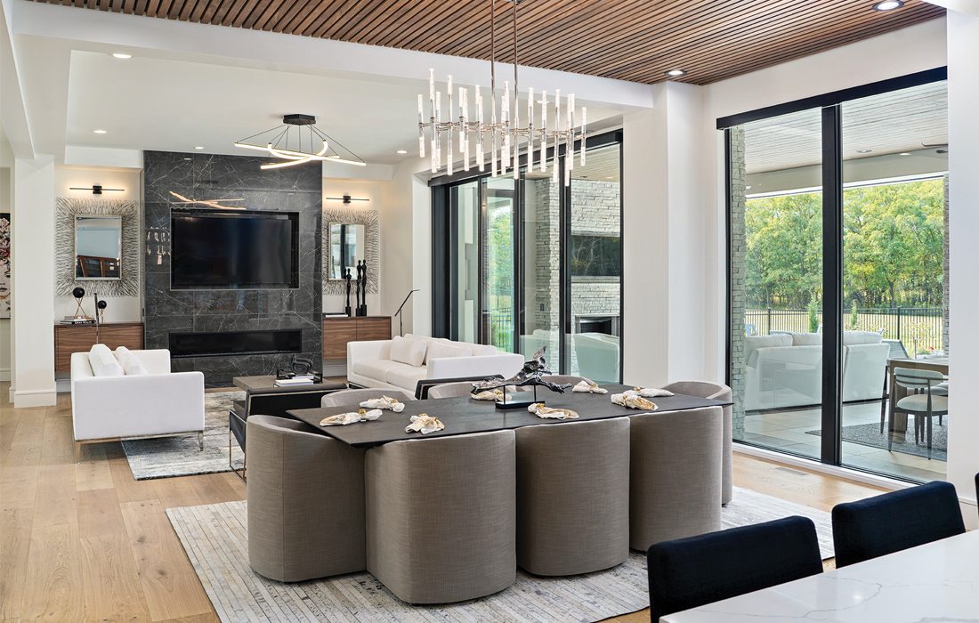
A large common space on the main floor features the main kitchen, dining room and living room—illuminated by separate, purposeful light fixtures which anchor each space in its functionality. To tie the three spaces together, walnut accents adorn each room.
Ask the Builder
Jeremy Eck
How did the homeowners want to utilize the space in their home?
“They love to entertain, but they also have a family of five, so they wanted it to be a great space for entertaining but also a cozy space for everyday living. One of our main goals was to create a luxury feel while also maintaining a warm and inviting environment they could live in. Enjoying the home for years to come with their three children was a top priority in the overall floor plan and finish selection on this project.”
What was the biggest challenge in the building process?
“It was important for the homeowners to have zero steps between the indoor and outdoor living space. They wanted the spaces to blend together and feel seamless. Complete with a drainage system underneath, the suspended 2’ x 2’ imported pavers on the exterior patios blend to the level of the hardwood flooring inside the home—accomplishing the goal of a no-step integrated experience.”
What did it take to create the three-story floating staircase?
“It wasn’t just a floating staircase; it was a floating stairwell system. The stairwell has hidden engineered supports within the home’s structure to create the floating appearance. The steel structure was just the first part of this focal point though. The blending of custom white oak stair treads, stainless steel and glass handrail, accompanied by the perfect light fixture spanning the entire three-story stairwell, completed this statement piece.”

CATEGORY: $1,000,000–$1,999,999
Beauty & Balance
Surrounded by trees at the end of a country cul-de-sac, this home is a study in contrasts: dark and delicate, industrial and intimate, bold and balanced.
Builder
Mike Millikan, President of Millikan Building Co.
Home Designer
Casey Ennis, Architectural Designer and Owner of Dale Peer Home Design
From the very first glance, this minimalist modern home commands attention. Located on a wooded lot, surrounded by trees, the streamlined modern lines seem to both blend in and stand out—all by design.
“This is the second home I’ve been able to build for these owners,” says Mike Millikan, President of Millikan Building Co. “They know what they want and aren’t afraid to try something bold.”
Drawing on inspiration images from the homeowners, Millikan and home designer Casey Ennis designed a single slope roofline and a facade with dramatic, dark tones. That facade then influenced the design choices inside, including industrial touches like exposed pipes, stained concrete floors and uncovered, oversized windows.
“We created a glass gallery that centered the home, which created a bright, open space, drenched in natural light,” says Ennis. “From the front door, you can see through the whole house to the courtyard. That achieved that wow factor when you walked into the home that complemented the bold exterior.”
With a 8’ x 12’ all-tile wet room in the primary suite, serene plunge pool in its courtyard and rooms placed intentionally with views in mind, this home becomes a liveable, comfortable retreat.
“People don’t just like the clean lines of a modern home, they quickly realize how simplicity makes them feel, living in it every day,” says Millikan. “A minimal space, well designed, makes you feel happy when you come into it.”
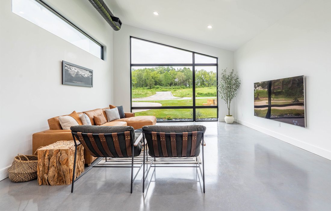
Dramatic windows and dark tones are a bold design feature, but each room in this minimalist modern home is bathed in natural light. In the common room, a massive window extends to the roof line, harmoniously bringing the outdoor and indoor spaces together. Plus, exposed ductwork becomes both a necessary and intentional design detail, complimenting the stained concrete floors.
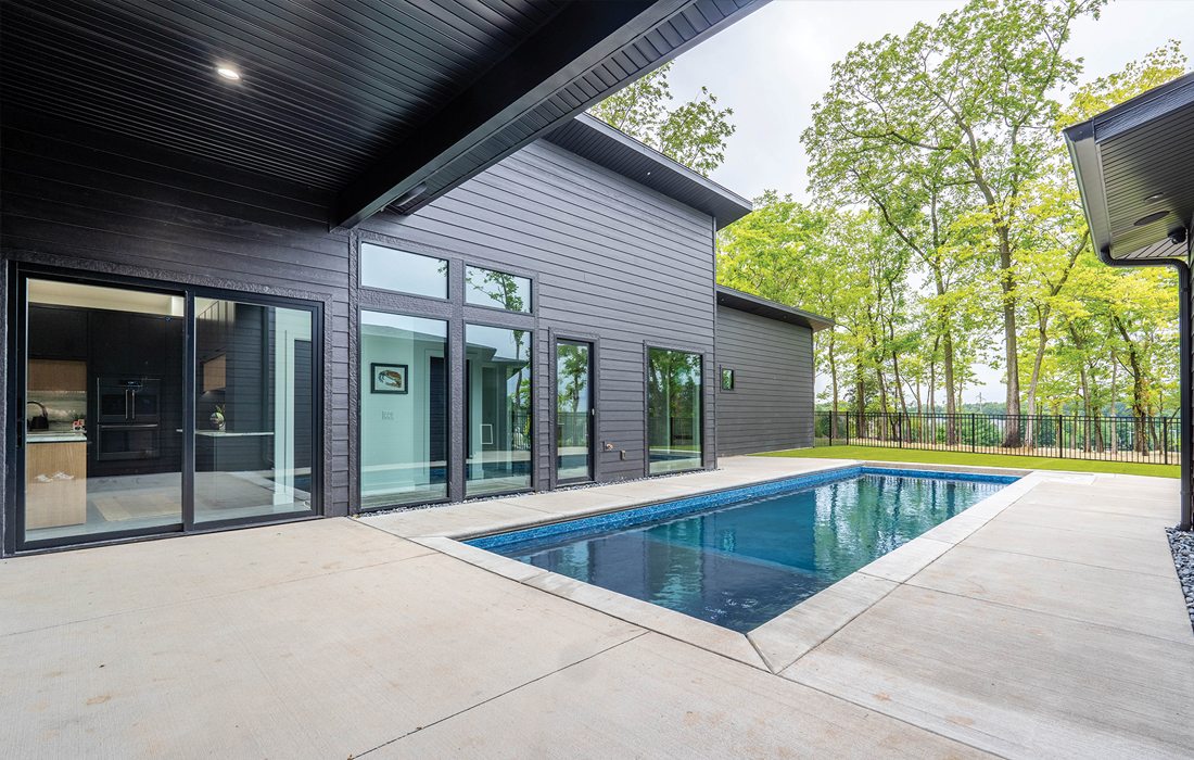
A symmetrical plunge pool by Pleasure Pools is perfectly placed in the courtyard area. At only 10 feet wide, the pool’s lean and linear design echoes the clean lines and minimal design of the home. Inside the pool, black plaster invites you into its depths.
Ask the Builder
Mike Millikan
What did the homeowners want to achieve with their home?
“They wanted to achieve a modern space with lots of windows that fit into their wooded lot. They wanted their massive windows to bring the outdoor spaces harmoniously together.”
Why include exposed vents and pipes in the finished home?
“Exposed pipe was a necessity. With an ultra modern flat roof design and building on a concrete slab, we had no other option but to run the exposed ductwork. But along the way, we discovered that we really liked the look. The exposed vents and pipe tied all the spaces together, so it was a win-win.”
How did you bring warmth to an ultra modern floor plan and design?
“We added some wood ceilings and chose wood cabinetry, specifically to soften that industrial feel and create some warmth. By adding wooden accents in different areas and using different materials, we were able to bring texture to the space, while also complementing that industrial look.”

CATEGORY: $500,000–$999,999
Made to Entertain
A space made for entertaining and aging in place, this home was built to be a place where someone could work, play and thrive.
Decorator
Jennifer Barnett, Just Like That Interiors & Home Staging
Builder
Travis Miller, President of Travis Miller Homes
Home Designer
Jason Thompson and Noah Fry, J.L. Thompson Design Group
Late in her career, but never late to a party, this homeowner was ready to build a space of her own. After seeing a home nearby that she loved, the ambitious homeowner contacted Travis Miller to build a similar home that would serve her well in the years to come.
“We knew it was going to have a smaller footprint, but she didn’t want it to feel small,” says Miller. “So we chose 12-foot ceilings, custom built shelves and used the roofline of the house to create taller, more unique ceilings in the bedrooms and the sunroom to make the home more grand for her guests.”
For an avid entertainer, the home needed multiple spaces with lots of places to gather. By utilizing an open concept design, even in a small footprint, the home can accommodate dozens of guests, says interior designer Jennifer Barnett.
“There are five zones for guests to sit comfortably while they visit, and they are all visible from one another,” says Barnett. “This home truly takes open concept to a new level.”
With a hidden home office behind the kitchen, concealable with a sliding pocket door, this home goes from fun to functional with ease—no matter the homeowner's plans.
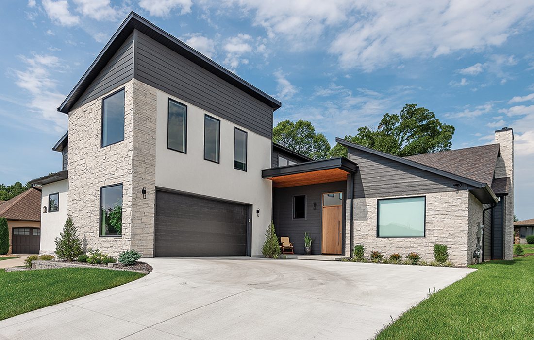
This two-bedroom home looks anything but small from the street. A single slope roof with modern lines makes a statement from the curb, and a wooden door with a flat, metal awning overhead makes this modern building feel like a home. Over the garage is a bonus room, the only second-story element to the home.
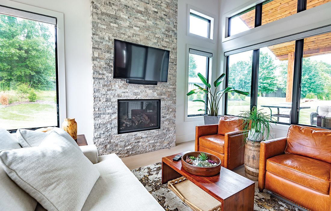
A cozy space, no matter the season. The homeowner wanted a sunroom that felt spacious for her guests and a retreat for herself. “A tall, stone fireplace makes the room feel grand, and we used the high roofline to make it feel even larger. Plus, the transom windows lining the top of the room elevated the eye and brought in so much natural light, it transformed the space,” says Travis Miller, builder.
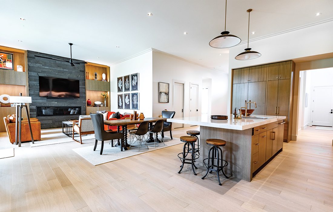
White walls, big impact. The homeowner can entertain guests in a variety of spaces, all connected. Artwork and wood tones brighten the open concept living space, making the space feel warm and inviting. Just steps away from the kitchen, a home office hides behind a pocket door.
Ask the Builder
Travis Miller
What was your approach to the home’s interior lighting?
“In the living room, that’s where everybody gathers, so we wanted to highlight the shelving with lighting to make them pop. By adding lighting to built-ins, you’re able to make the items within them a design statement. Any high-end store will have lights on their shelves to make the items within them a focal point. The items on the homeowner's shelves were very important to her, so it was important that they truly shine.”
How did you use scale to make rooms appear larger than they are?
“The sunroom has the roofline to make it feel larger; it slopes from one end to the other side of the room. That made that room feel bigger. But we also added transom windows above a standard window to make the walls feel even taller, and more windows bring more natural light into a room. More light always makes a room expand.”
What is your favorite detail in the home?
“When you walk into the entrance, we used a different type of crown moulding. Adding an extra level of crown that matched the paint color of the ceiling was a super intentional but small detail, but that extra detail makes the space feel more cohesive, modern and elevated. It tricks the eye to make the ceilings feel even higher.”

CATEGORY: LESS THAN $500,000
A Charming Collaboration
With design choices made by thousands of Ozarks FOX AM viewers, this home’s fixtures and comfortable living spaces feel right at home—and right on trend.
Builder
In a way, thousands of people from 417-land helped build this home.
Ozarks FOX AM co-host Jeremy Rabe led a special ongoing segment this summer, Jeremy on the Job with Cronkhite Homes. Ozarks FOX AM would visit the jobsite and present viewers with design options, all of them pre-approved and sourced by Cronkhite Homes. Then, viewers would vote online and watch as the home was built, one choice at a time.
“My favorite design choice made by the viewers was the amazing luxury vinyl plank flooring,” says Rabe. “The color they picked, Hickory Hollow, was my absolute favorite. They made the perfect selection not only design-wise, but for durability as well.”
Inside the home, spaces are designed for mass appeal. The open-concept living space features a kitchen island and sink facing the living room, with cabinetry that provides storage and style. Vaulted ceilings bring height to the interior common space.
Just outside, a porch with countryside views brings the outside in. Additionally, a spacious primary en suite bathroom with surprising and stylish fixtures elevates the home’s interior.
“We wanted the primary bathroom to feel really luxurious,” says Kelsey Sneed, marketing manager at Cronkhite Homes. “Adding oversized tiles and granite countertops makes it feel like a retreat, and everyone deserves a bit of luxury in their home.”
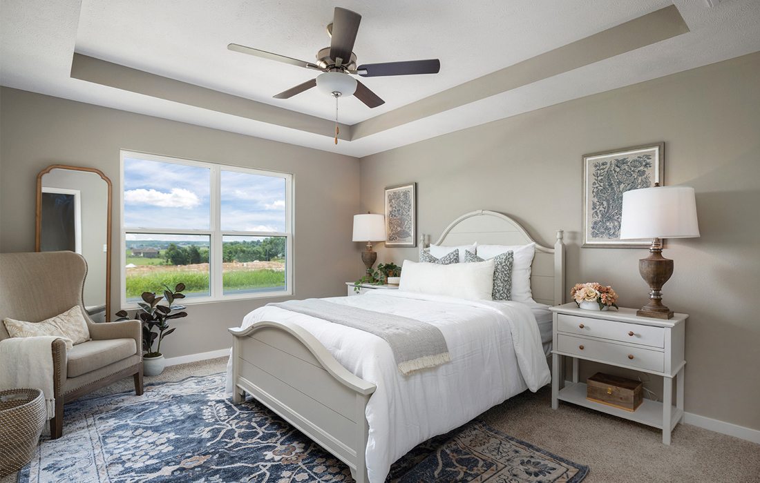
A vaulted ceiling brings height to a grand primary suite. A large double window brings in natural light, and warm tones bring a cozy vibe to the space. Plus, a primary suite situated opposite the other two bedrooms helps this space feel truly like a retreat for the homeowners.
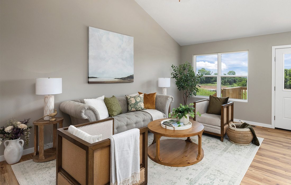
A vaulted ceiling helps to open up the open concept living area. Underfoot, warm tone wood flooring makes this room feel grounded and inviting. “We’ve seen a lot of warmer colors and tones coming back into homes, and this is a trend we expect will continue to grow,” says Kelsey Sneed, Cronkhite Homes.
Ask the Builder
Cronkhite Homes
Why did you want to build a home in collaboration with a local morning show?
“We wanted to build a home that related to the Ozarks FOX AM audience. We wanted to make home ownership as accessible as possible, to as many viewers as possible, so we included the audience in the process. Plus, when viewers had the option to cast their votes on the home’s design, we knew that it would have the most popular and desirable finishes. This home is truly representative of what the average homeowner wants in Southwest Missouri.”
What finishes weren’t available for viewers to choose?
“The floor plan and exterior were not voted on by the public. We have a set selection of exteriors, but in this community we were building, we knew what the homes would look like next to this home. We wanted to ensure this home would stand out and have great curb appeal next to its neighbors, and the finished product reflects that planning.”

CATEGORY: Renovation/Restoration
A Brand New Nest
When their children left the nest, this home’s owners wanted a place of their own to play and make new memories. With a playful spirit and always saying “yes,” they transformed their family home into something unexpected, playful and utterly chic.
Interior Designer
Erica Lea Hendrix and Kayla Ziehr, Erica Lea Design Studios
Builder
Travis Miller, President of Travis Miller Homes
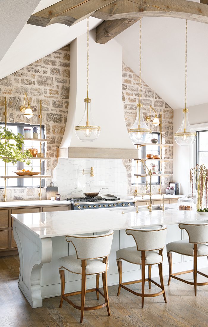
The homeowner dreamed of a French-inspired kitchen fit for a culinary artist. She and interior designer Erica Lea Hendrix cooked up a French provincial kitchen with a modern flair. The star: its handcrafted Lacanche range, imported from France, and an unlacquered brass faucet, designed to become tres chic as it’s used.
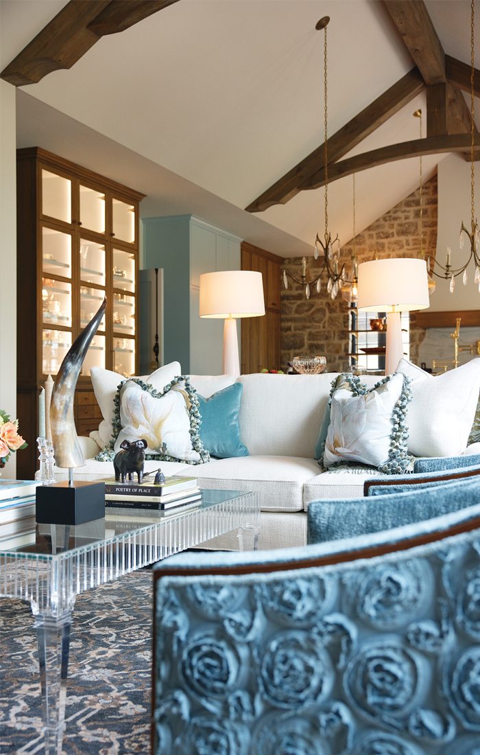
Vaulted ceilings and handcrafted stone give this home an old world look. “The goal was to make the grout joints bigger so they overran the stone, that was the look we wanted throughout the whole house,” says Travis Miller, builder. “From the color to the finishing to the shape and placement of the stones, the stone installers and the Fraley Masonry materials helped make that vision come to life.”
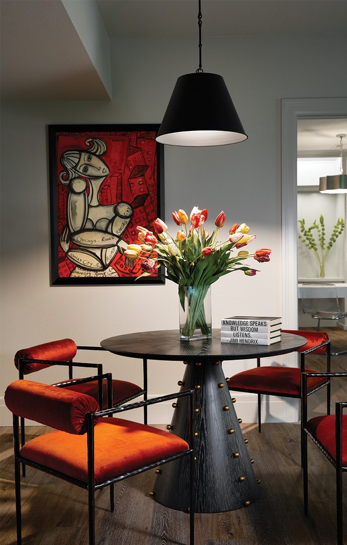
Daring colors highlight this seating area. Towered over by an industrial fixture and bold, modern artwork, this space is grounded by a circular table featuring brass knobs and orange velvet chairs. “Before, the home was traditional, but the homeowners didn’t struggle with moving away from that into something bold, unique and fun that flawlessly complements the life they want now,” says Erica Lea Hendrix, interior designer.
After becoming empty nesters, a couple wanted to build a new place for a new phase of life—instead, they made their beloved family home an entertainer’s haven.
After taking an aging home down to the studs, Travis Miller spent 13 months renovating a blah contemporary into a French provincial modern manor. Erica Lea Hendrix, principal designer, extensively collaborated with interior designer Kayla Ziehr to develop a cohesive design that wowed both the homeowners and their guests.
“The homeowner never said no,” says Hendrix. “They were open to anything we proposed, and that made the process enlightening and fun. They didn’t struggle with moving away from a traditional space into something bold, unique and fun that flawlessly complements the life they want now.”
Vibrant colors, avant garde furniture, a hidden bathroom and a Lacanche Handcrafted French range are all reflective of the home’s chic and playful vibe. Instead of a dated dining room and haphazard home office, there is a social club, featuring the highest gloss paint possible.
“That room took longer to paint than the entire house,” says Miller. “They took so much time to get that mirror look because the reflections on the wall had to be precisely smooth and perfect, and it took a very skilled painter to do it. But the finished product is literally flawless.”
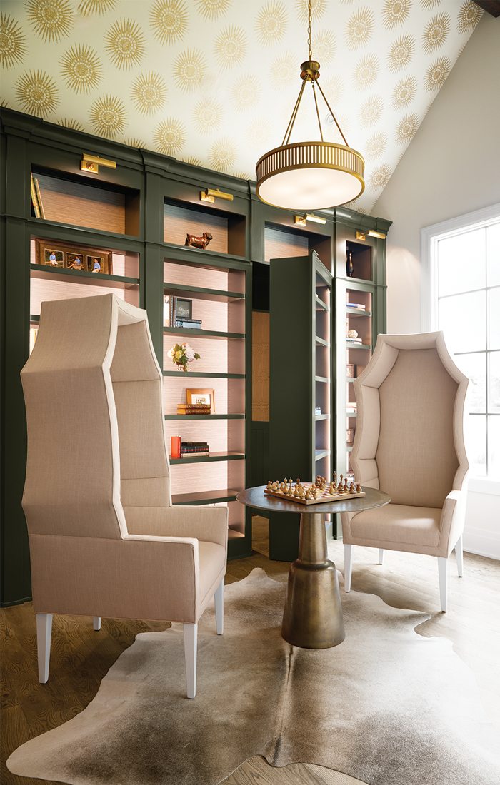
Two coffin chairs, one hidden door, what more does this library have in store? A raised, wallpapered ceiling brings the scale, with lit pink built-ins and metallic fixtures to illuminate decor and, of course, books. Behind it all, a hidden powder bathroom.
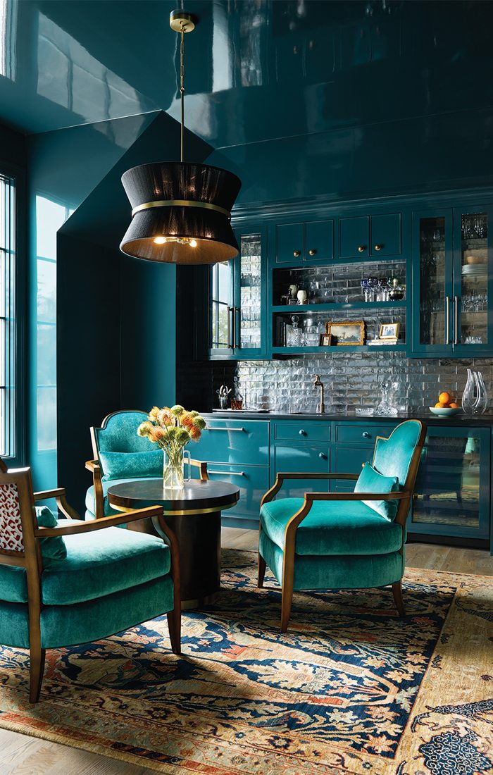
It’s not a high-end cocktail bar in Brooklyn—it’s an in-home social club. Displaying the most high-gloss paint possible, this room features a mirrored paint finish that truly shines. Previously a makeshift home office and outdated dining room, this space now is built for card games and craft cocktails—both served by the homeowner. It’s part of the Renovation/Restoration category’s winning home.
Ask the Builder
Travis Miller
How did you approach the hidden door and bathroom off the library?
“It was a combination of working with the cabinet company and them knowing the parameters of the space. Then, it’s sourcing the hardware. With the space, you have the depth of the library cabinets, so it’s not just a hidden door in the wall, it’s a whole panel that has to move. There was always a bathroom off of that office, and they didn’t want to lose it, and they didn’t want a door to the bathroom, so this was the creative solution we came up with.”
What is your favorite space in the home?
“The kitchen is incredible. Just standing there at the island, looking at all the detail with the brass shelves; that took some real fabrication and thinking through. But then there’s the unlacquered brass faucet, the custom China display hutch, the vaulted ceiling with the stone all the way up that we hand grouted, the beams. The homeowner is a great cook, and this space deserves someone who truly loves to cook. I know it’s gorgeous to look at it, but I know she’ll enjoy using it for years to come.”
Tips from the Pros
What specific strategies do you use to elevate a home’s interior?
“Don’t be afraid to try a different, bold color. Try to accent a wall with a dark color. I think a lot of people think that when repainting a room, you have to do the whole room the same color, but you can do the one wall that has windows on it in a darker color. You can do the same technique with wallpaper, and wallpaper’s coming back with a force. Be willing to try, and if it doesn’t work, it’s just paint. Try again.” — Travis Miller, Travis Miller Homes
“Going big has its advantages. When a shower area is really tall and has lots of space, it creates an aesthetic, but adding oversized tiles, a long niche over the tub, a large window—big design elements, all together, have a huge aesthetic impact on a space.” — Mike Millikan, Millikan Building Co.
“Use inspiration images, but then try to understand why they were chosen. Is it the color, the furniture, the feeling? The best part of the design process is being able to see all the cool elements, the funky furniture, the artwork, all come together. But that starts from a concept, and fully understanding the feeling you want in a space is really what takes a home to the next level.” — Kayla Ziehr, interior designer, Erica Lea Design Studios
“Add lighting to built-ins. Lighting your shelving is worth the dollars if you want to showcase items. It’s an easy add-on, but it makes a big difference.” — Travis Miller, Travis Miller Homes
“Getting spaces just right is important when designing floor plans, but be mindful of the views. Fitting a home on the lot just right to capture the sunrise or placing a window so it has the best possible light takes time, but you’ll never regret getting it absolutely perfect.” — Casey Ennis, home designer, Dale Peer Home Design
What small details have a big impact within a home’s design?
“So many clients take their spaces so seriously that they forget to laugh. I love it when you walk into a space and see something unexpected and chuckle. Your home is where you spend most of your time; having a little touch of the unexpected can make it feel magical. Adding just one unique chair or piece of art can really elevate the look and reflect the homeowner’s personality.” — Erica Lea Hendrix, Erica Lea Design Studios
“Crown moulding is something that can and should be done differently. It doesn’t have to be curved, it can be flat or stacked on top of each other. Having a specific element to the perimeter of a space has a really cool look, and it complements a space and adds depth.” — Noah Fry, project lead at J.L. Thompson Design Group
“Kids’ rooms can often be overlooked in the design of a home, so we like to bring children into the design process. Let them share inspiration photos or even drawings of what they want their room to look like. Then we can pull together some inspiration from their ideas before making those final selections. We also make sure that each child has a unique detail in their room. It could be wallpaper or a walk-in closet, but when you decide together, the space will feel like their own while also being a cohesive part of the rest of the home.” — Chelsee Sowder, Chelsee Sowder Interior Design
What trends can we expect to see in homes in 2024?
“Luxury vinyl plank flooring is going to be even bigger, especially in warm tones. It provides a realistic wood look but is water resistant, low maintenance and extremely durable. It has a luxury look at an affordable price.” — Kelsey Sneed, marketing manager at Cronkhite Homes
“Aging in place is something we’ve all been hearing about. Having a home designed with one level or a caretaker suite in mind, or zero entry showers, the laundry room accessible from either the primary closet or the other suite—these are all design decisions that help a homeowner enjoy their home longer.”— Jennifer Barnett, interior designer and owner, Just Like That Interiors & Home Staging
“Wet rooms are a trend, when you can afford it. Having a whole room where you can access any area, the tub or the shower, not having to worry about dripping across your floor, is really the height of luxury.” — Mike Millikan, Millikan Building Co.
“Wallpaper and wood accents are very popular now, and you can find them at any price point. Even choosing to paint a ceiling with color—all of these selections and details make a home unique and call attention to the homeowners’ personal lifestyle and preferences.” — Jeremy Eck, Eck Group Building & Development LLC.
Homes of the Year 2023 Judges
Hallie M. Bowie
Hallie M. Bowie of New Leaf Home Design has been working with homeowners since 1987 to create beautiful home additions, renovations and healthy, right-sized new homes with excellent comfort, energy efficiency and durability. Bowie is a licensed architect, LEED Green Associate and NAHB Certified Green Professional. She has won numerous awards including from the U.S. Department of Energy’s 2023 Housing Innovation Awards and Better Homes & Gardens magazine.
Darren Shultz
As a second-generation builder, Darren Shultz with Shultz Design and Construction has lived through the high-end residential construction world for over 30 years. With Shultz leading his team as Principal Builder, Shultz Design and Construction has been featured in local and regional design publications such as 330 Homes and Cleveland Magazine. As a Past President of the Summit and Portage Counties HBA, he is committed to the industry and future of construction through involvement of the OHBA and NAHB.
Mark Verdova
Since graduating from the University of Dayton in 2003, Mark Verdova of Payne & Payne Builders Inc. has helped hundreds of families achieve their goal of building a new home in both the Ohio and Virginia markets. His years of experience coupled with his knowledge of land, design, financing and construction allow him to effectively manage the process of homebuilding.


