Featured Homes
Dream Home Renovations
From single room updates to whole home overhauls, six Springfield families took the leap into home renovation. Peek into their newly renovated spaces and find inspiration and home pros for your own dream projects.
By Ettie Berneking
Sep 2019
As the saying goes, "Love where you live." But sometimes you'd love it a little more if your home were made exactly to your life's needs and your design specifications. Luckily, with help from a few pros and a whole lot of vision, a renovation can turn your home into the space you've been dreaming of. We've gathered renovations of all scopes and sizes, from a complete Rountree overhaul to a dazzling one-room fireplace face-lift, to help you plan your own project. You've already got the dream; now, are you ready to renovate?
Whole Home Remodel | Midcentury Marvel
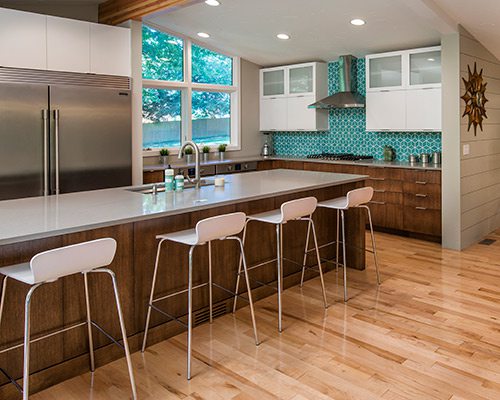
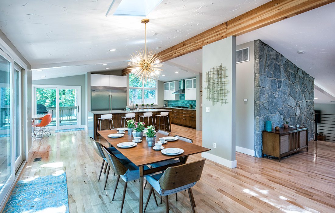
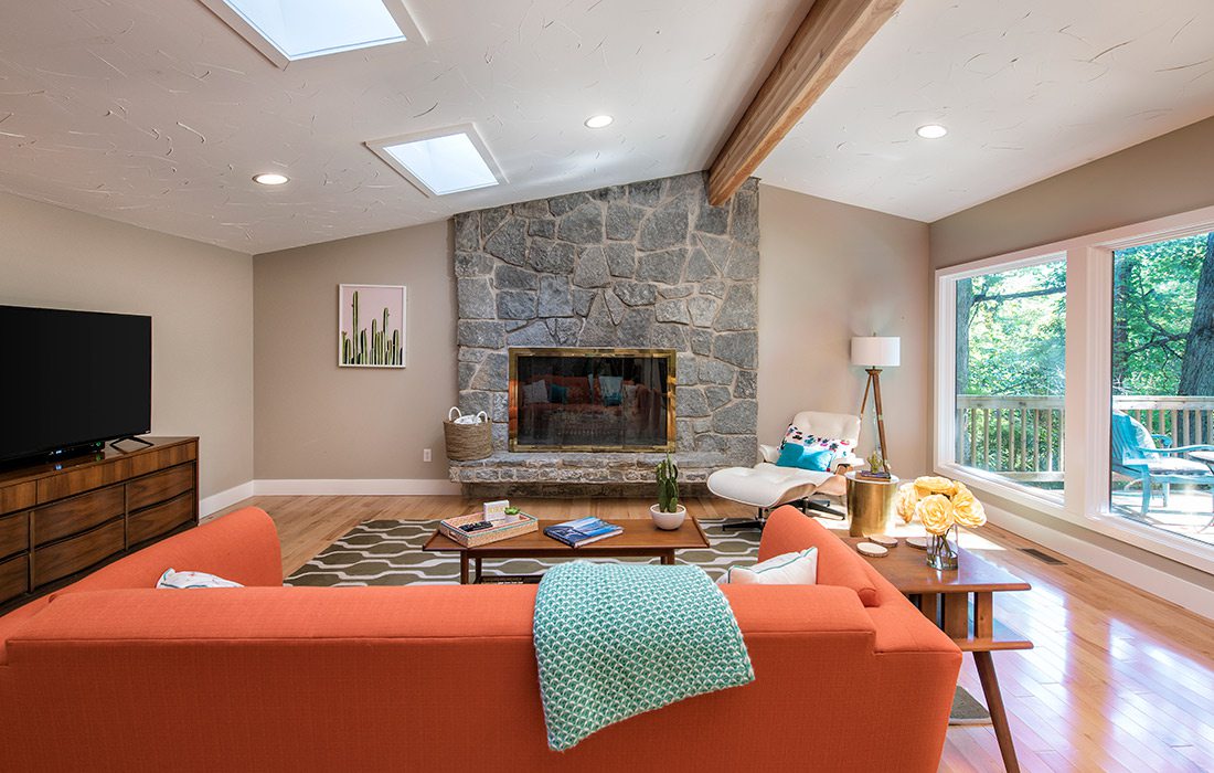
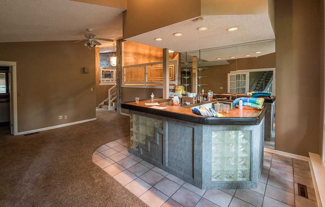
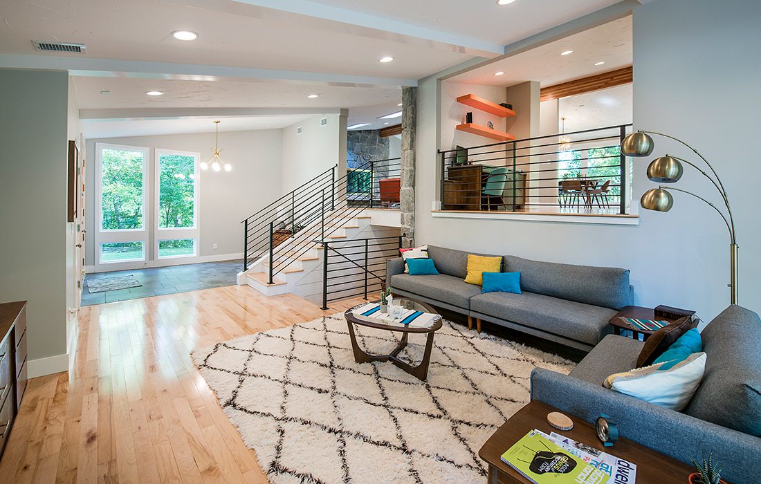
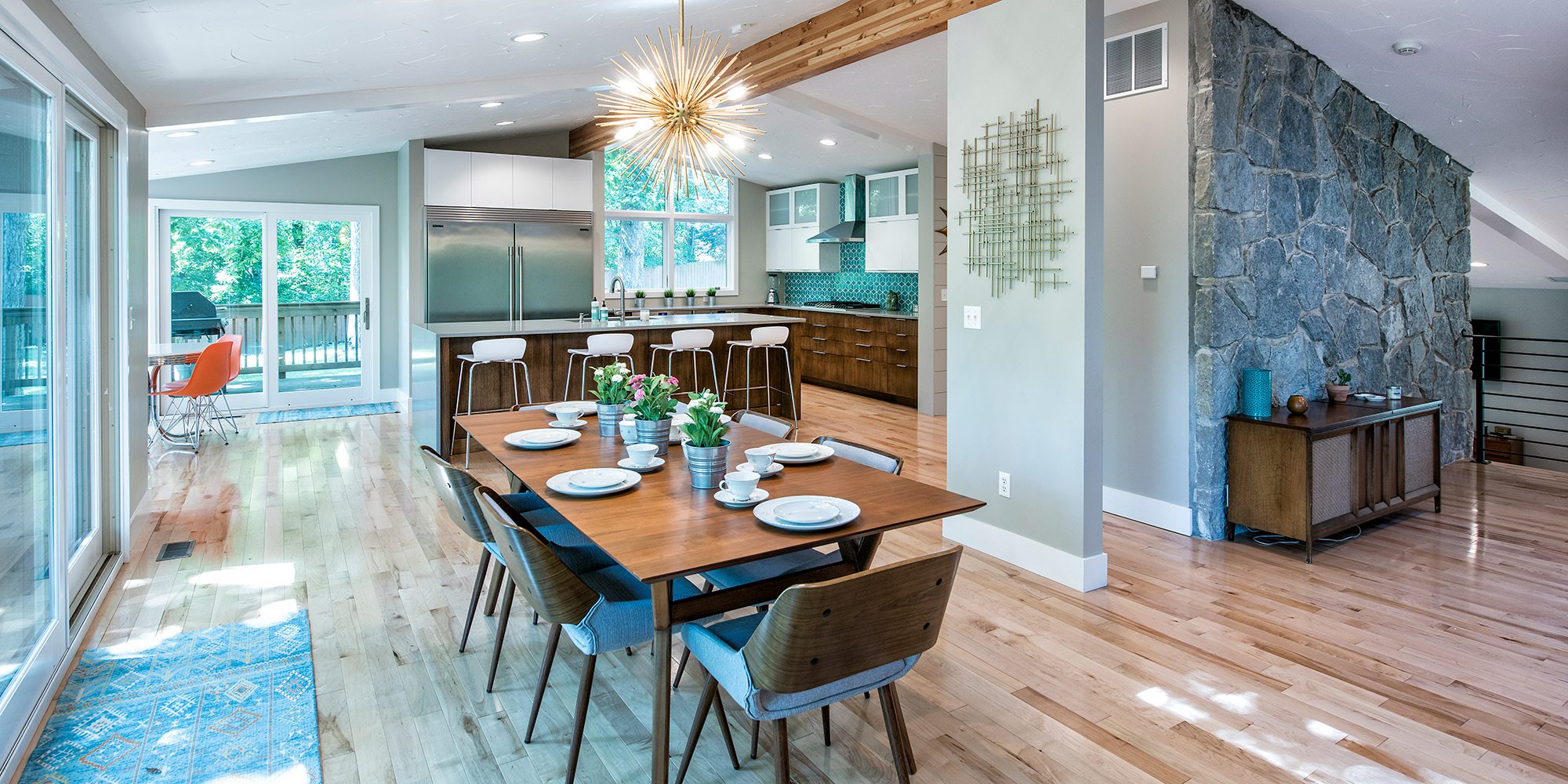
When these homeowners bought this spacious midcentury home, they knew it needed some serious updating. But when Jason Bekebrede with Monticello Custom Homes arrived on site, he realized the home needed to be gutted to meet their design needs.
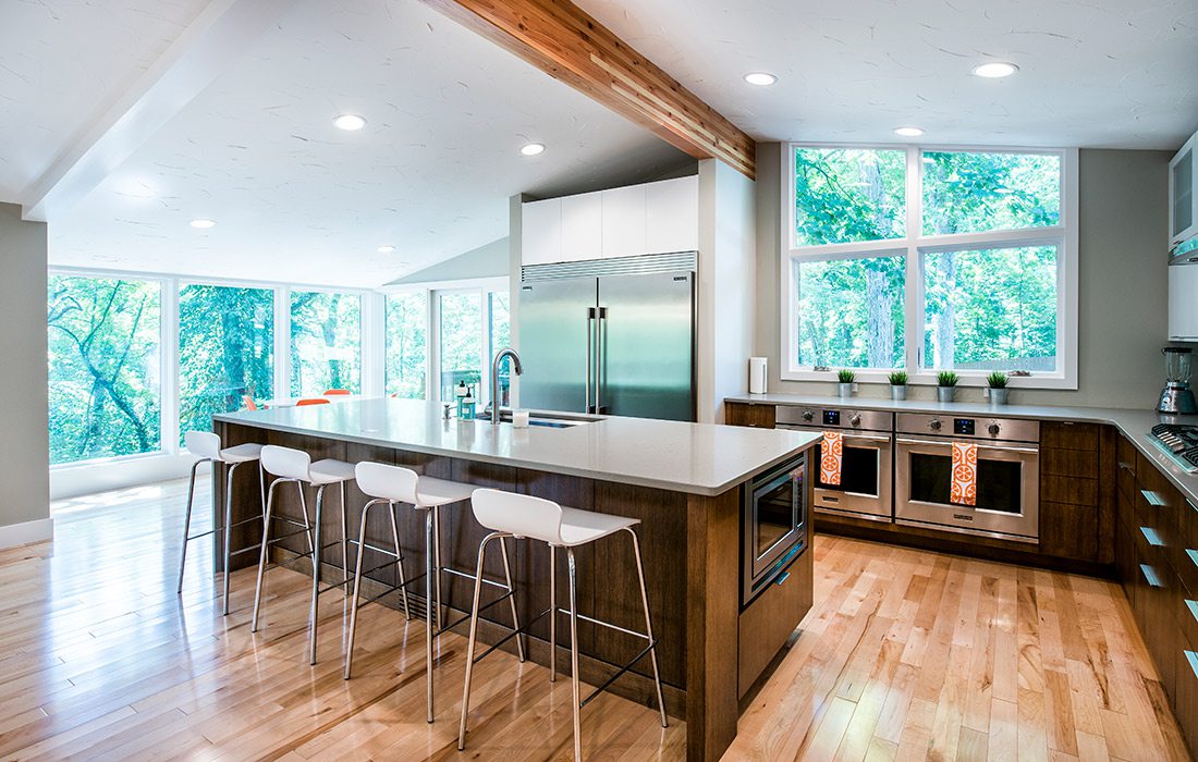
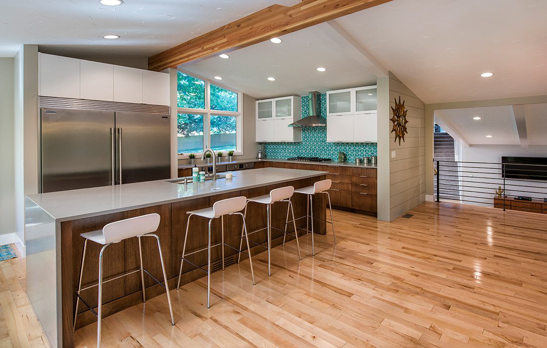
During the demo, Bekebrede discovered the floor in the screened-in porch was carrying too much weight, but the room was slated to become the new kitchen. “We had to reframe and build new floors in that room,” Bekebrede says. “We had it down to the studs. I’m surprised it was still standing.”
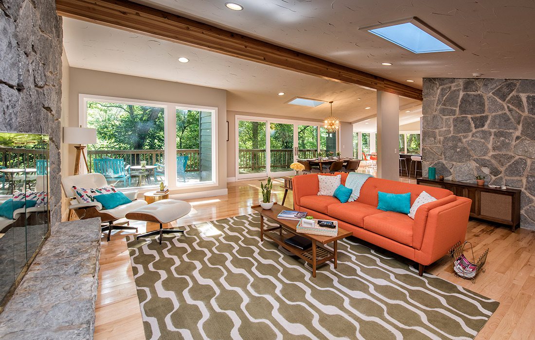
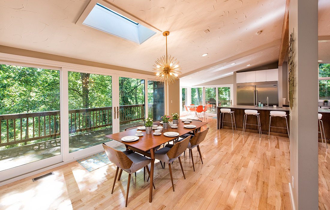
Luckily, the rest of the home didn’t need quite as much TLC, although there was plenty of work to be done. The overall goal was to hide the additions made to the home over the years. Walls between the kitchen and living room were removed to open up the floorplan, and ceilings were reframed to allow for the addition of new windows, which add to the natural light coming from the home’s five skylights. With the addition of a few creative finishes including the hand-troweled textured ceilings, the finished product is a modern home that captures plenty of the midcentury style the owners first fell in love with.
Whole Home Remodel | Rountree Renovation
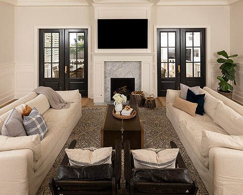
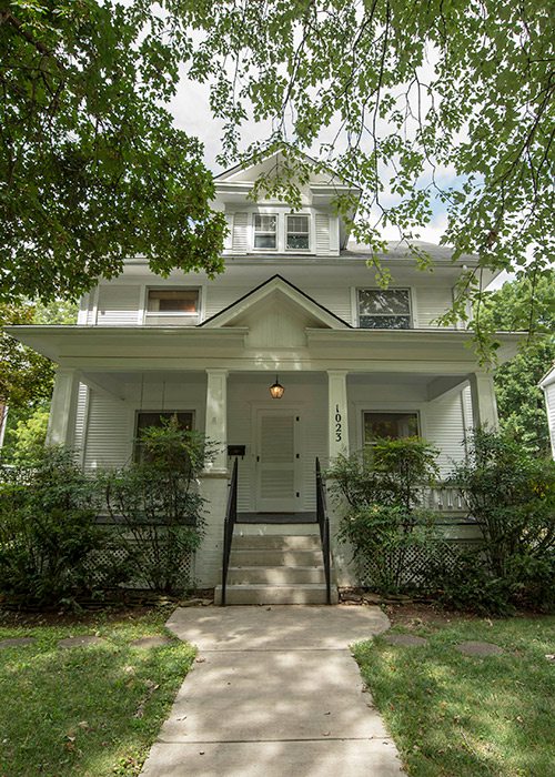
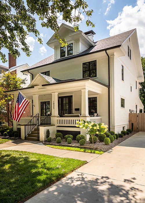
Looking at the Rogers’ stunning, 5-bedroom home on Pickwick, it’s hard to picture it torn down to the studs with the entire back of the house missing, but Kinsey Rogers has photos of the construction saved to her phone. Between photos of the home’s original yellow walls and tiny “hobbit half-bath” is a photo of her husband, Cade of HC Rogers Construction, waving from the second story as he looks out at the backyard. The entire back of the house is missing. “It might have been cheaper to build a new house,” Cade says. Part of what made this remodel so pricey was the addition of a new 35-by-35-square-foot living room and master bedroom along the rear of the home.
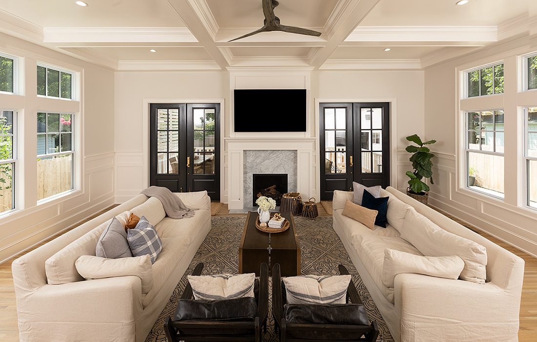
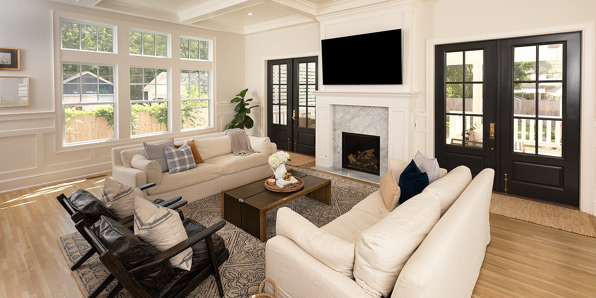
The extra expense was well worth it. The addition is nearly seamless with the original structure thanks to Cade and Kinsey’s dedication to finding material that matches the home’s original design. After tireless research, they managed to find the white clapboard siding that matches the original and even found hardwood flooring that flows nearly perfectly with the original. Every detail of this project was custom. Every finish was selected to match the 1914 style in which the home was first built. From the carrara marble floors and the coffered ceiling to the colonial-style wainscoting that runs throughout the first floor, every detail was carefully selected. So now when you look at the back of the home, you don’t see a new addition and back porch. You just see a beautiful historic home in Rountree.
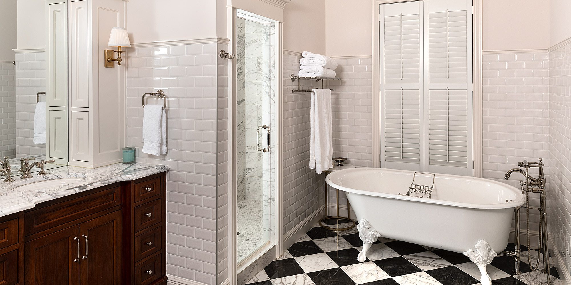
Bathroom Remodel | Stunning Black & White
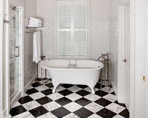
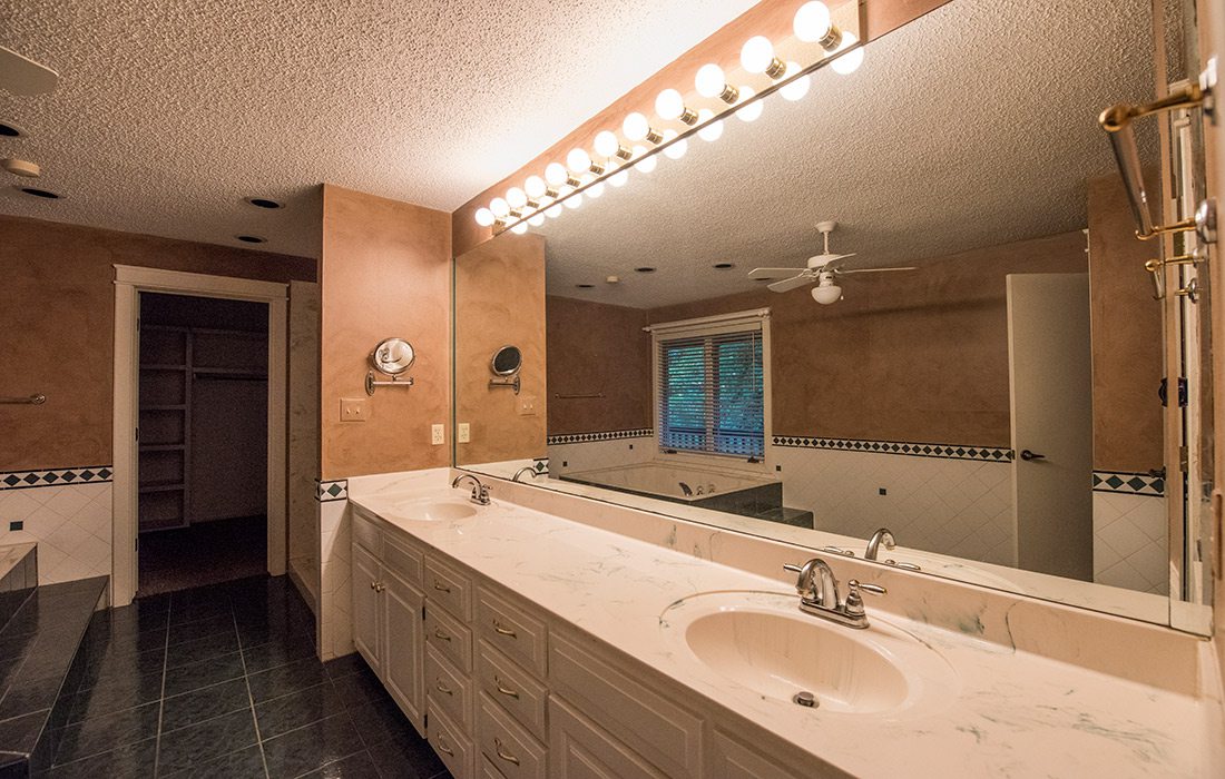
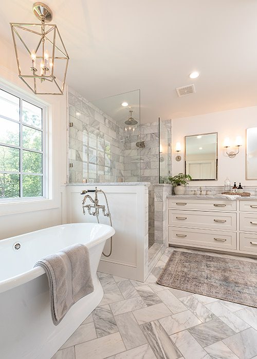
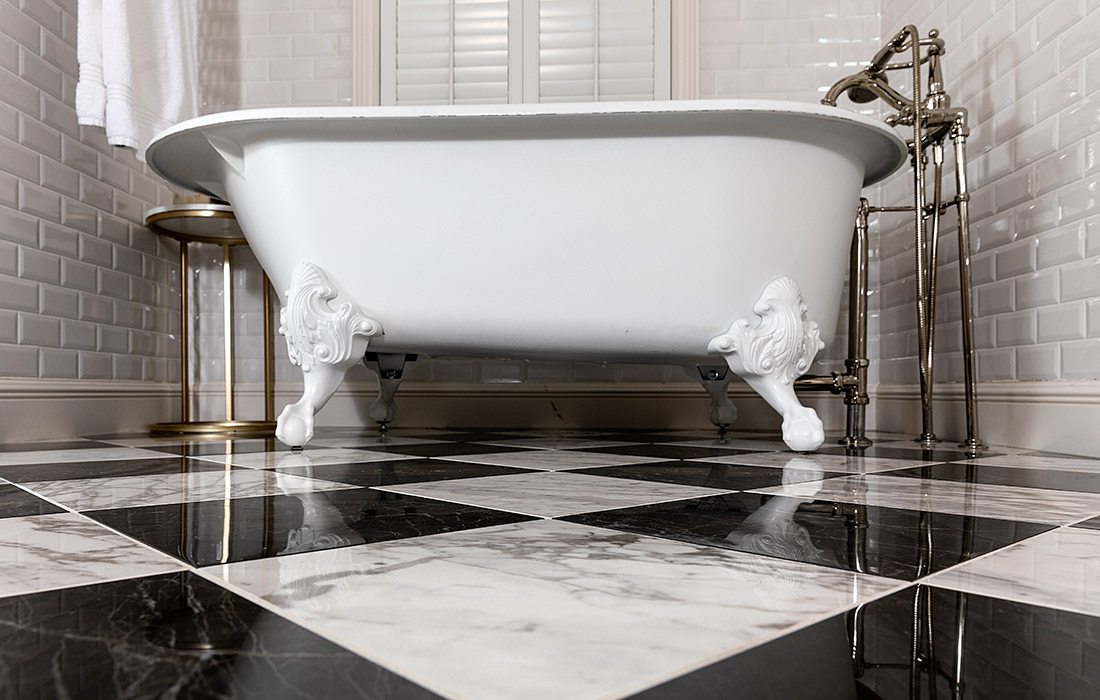
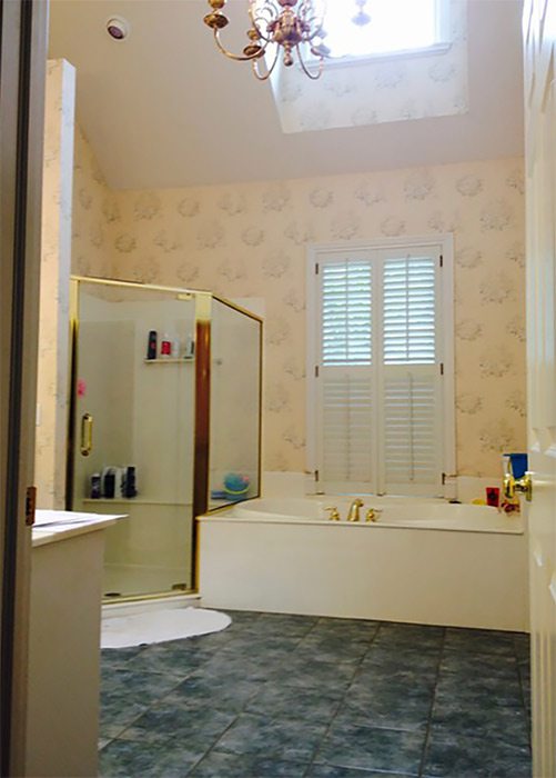
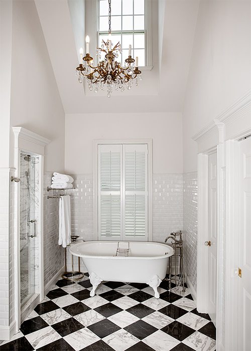
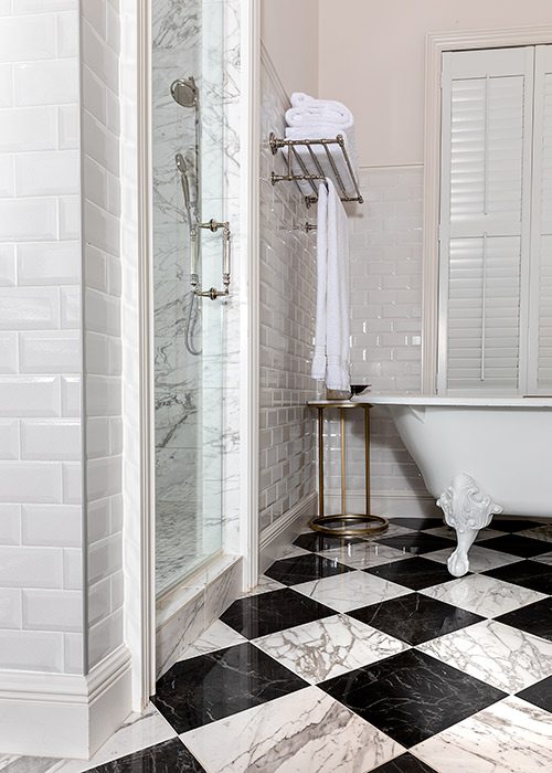
For those dreamers out there who wander into their master bathroom and feel nothing but disappointment, you’re not alone. Remodeling a bathroom can be daunting. You never know what structural damage lurks behind those walls, and moving tubs, showers and sinks can quickly price you out of the market. But when Brett Godfrey of Built By Brett started work on this outdated master bathroom, he used an upgraded floorplan design that would limit structural changes. To make the most of the existing floor plan, Godfrey tore out the original shower and cultured marble tub. “That took up a ton of space,” he says. “Removing the tub alone gave us extra width, length and depth.” All that extra space meant Godfrey and designer Erica Praschan had room to build an enlarged walk-in shower and close it off with a new wall. The addition of a rain head shower nozzle, two body sprays and a smaller clawfoot tub in the bathroom’s main quarters give the updated bathroom a much more relaxed, spa-like atmosphere. Add in the black and white marble floor tile, the gilded chandelier above the tub, ceramic wall tile and chair rail, and this outdated bathroom suddenly looks like something pulled from the Roaring ’20s. And all with little to no structural changes.
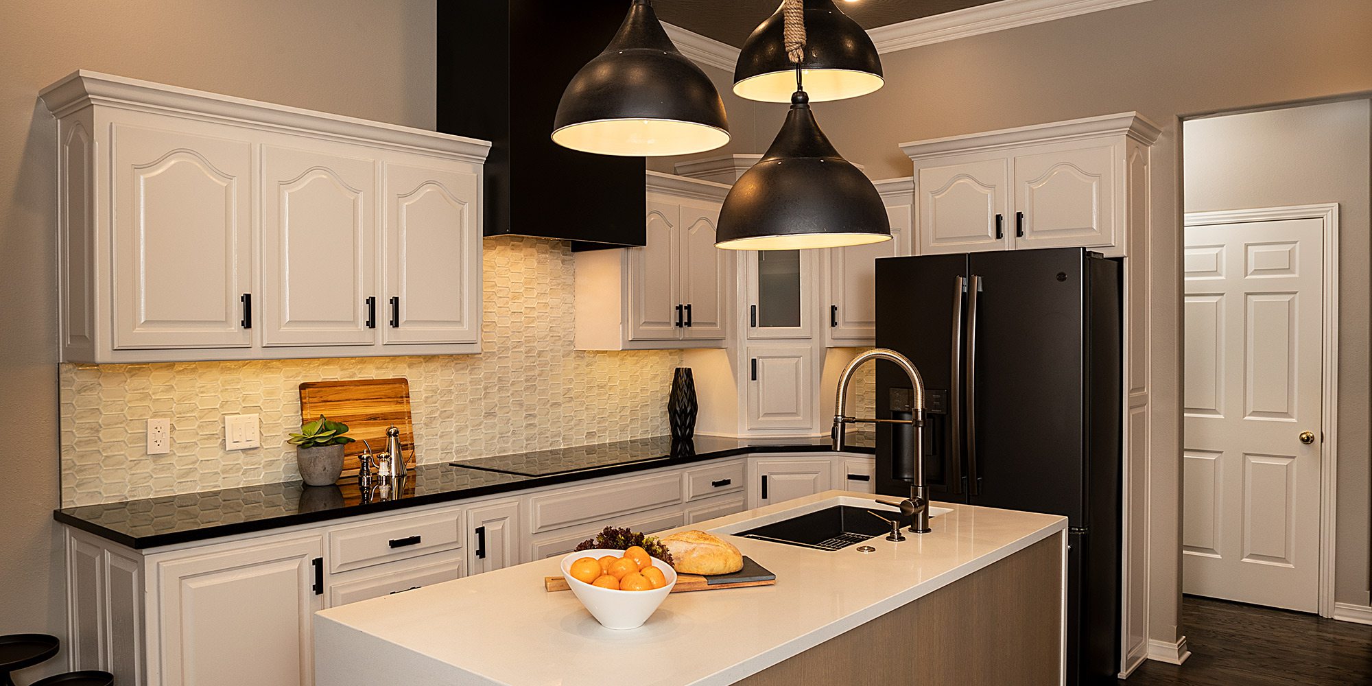
Kitchen Remodel | Contemporary Finishes
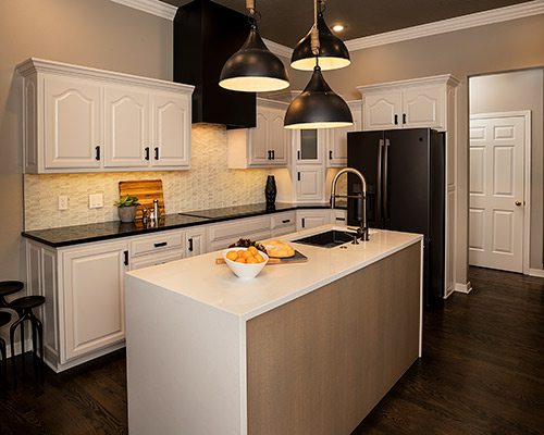
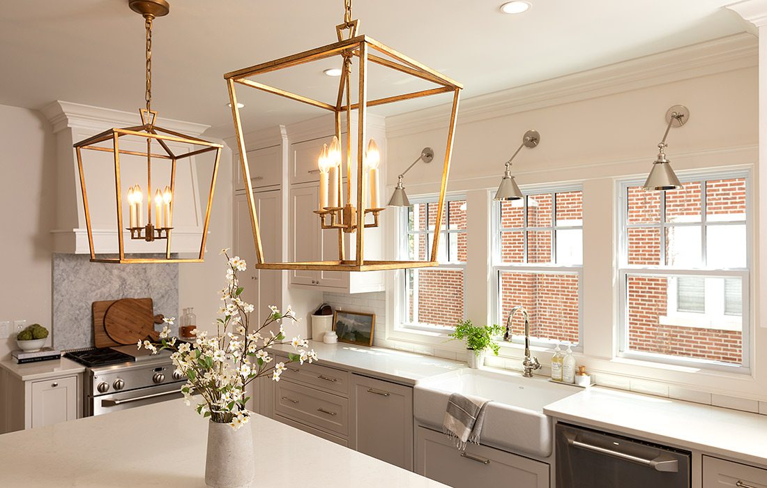
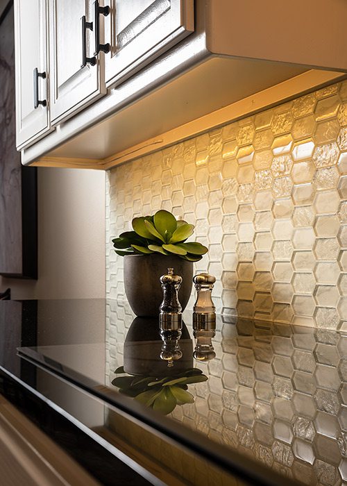
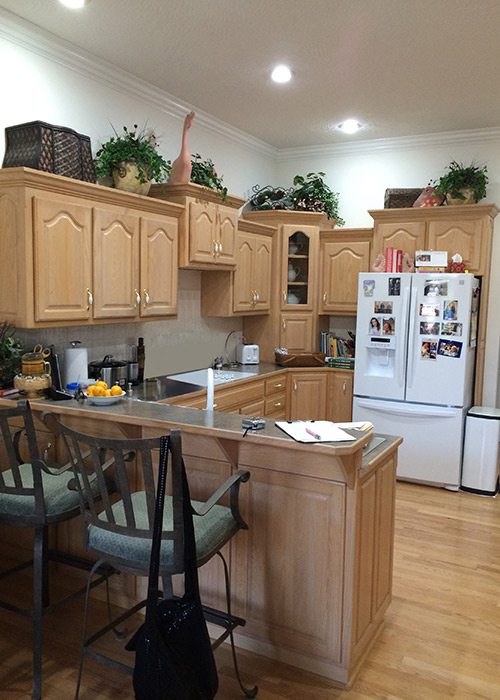
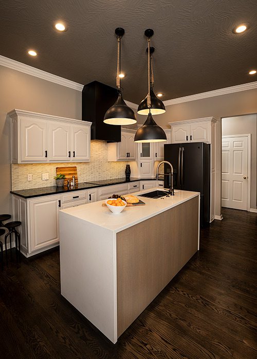
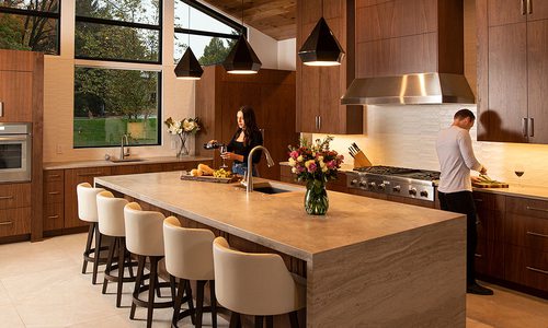
What do you do when your kitchen is screaming for an update, but your budget is sighing from exhaustion? You get creative, which is exactly what Gina McMurtrey did when updating this ’90s kitchen and dining room to improve the flow. To make the biggest impact, McMurtrey focused on refinishing the hardwood floors that run throughout the house and took the blonde stain down to an ebony. “That set the tone everywhere else,” she says. To make the most of a limited budget, McMurtrey skipped replacing the cabinets and instead gave them a fresh coat of paint. From there, the team tore out the peninsula and added a new island prep station with waterfall quartz countertops and a black matte-finish sink. The original can lights became black stainless pendants, and upper cabinet doors were replaced with glass shelves above a new coffee station. The oven hood was replaced with a sleeker design. “We took a pretty traditional kitchen and made it more contemporary while still being true to the architecture,” McMurtrey says, and that’s always the challenge. For the final touch, McMurtrey added her signature flair—a painted ceiling. “There’s usually a little hesitation, but everyone loves it in the end,” she says. “It balances the light walls and white cabinets and makes the room feel a lot taller.” That fresh coat of paint was one of the many minor changes that really made a big impact in this remodel.
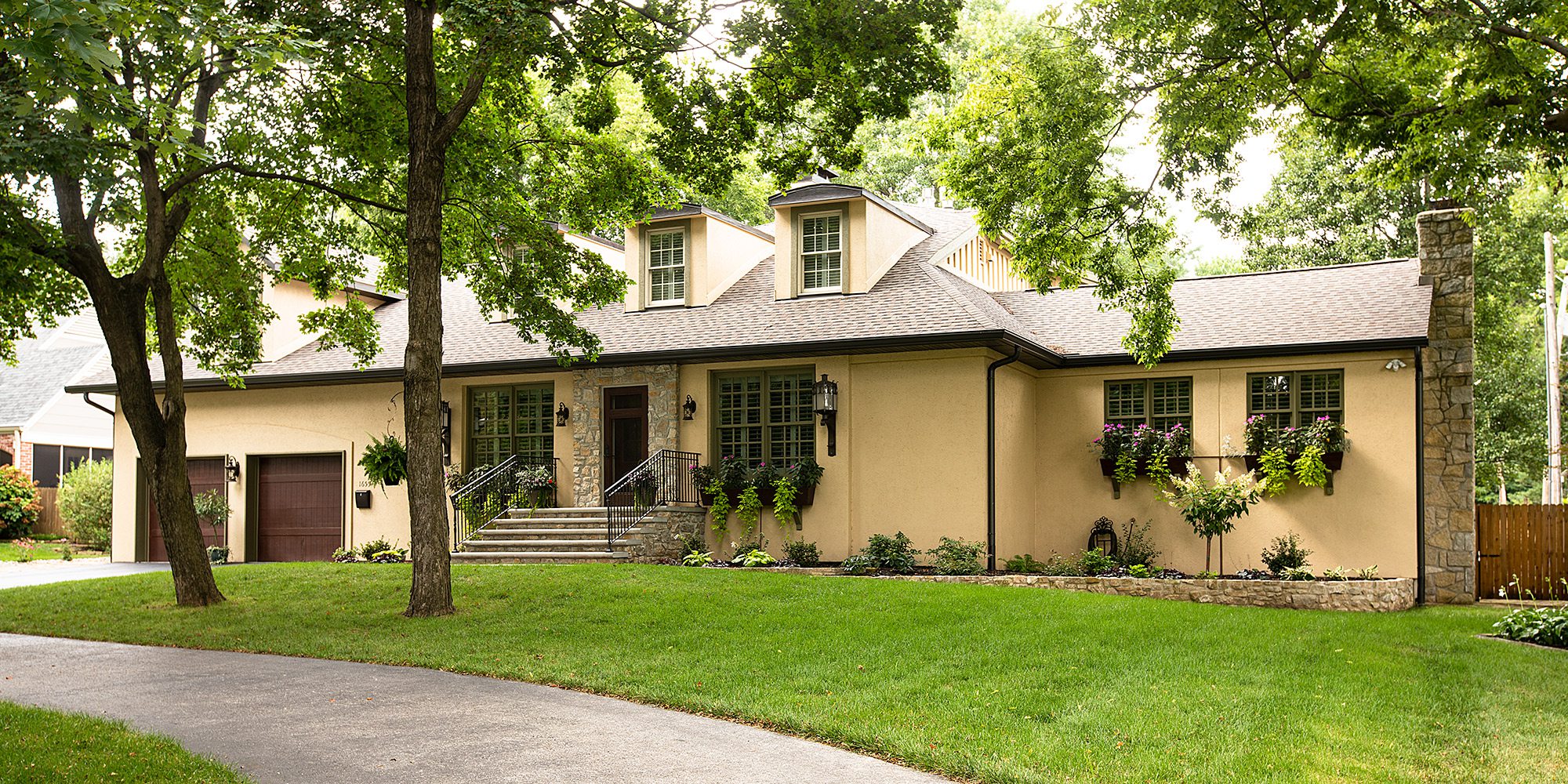
Exterior Remodel | Facade Face-Lift
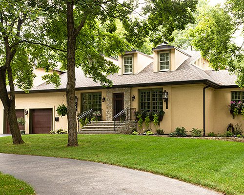
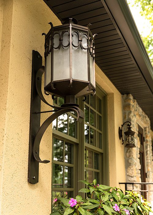
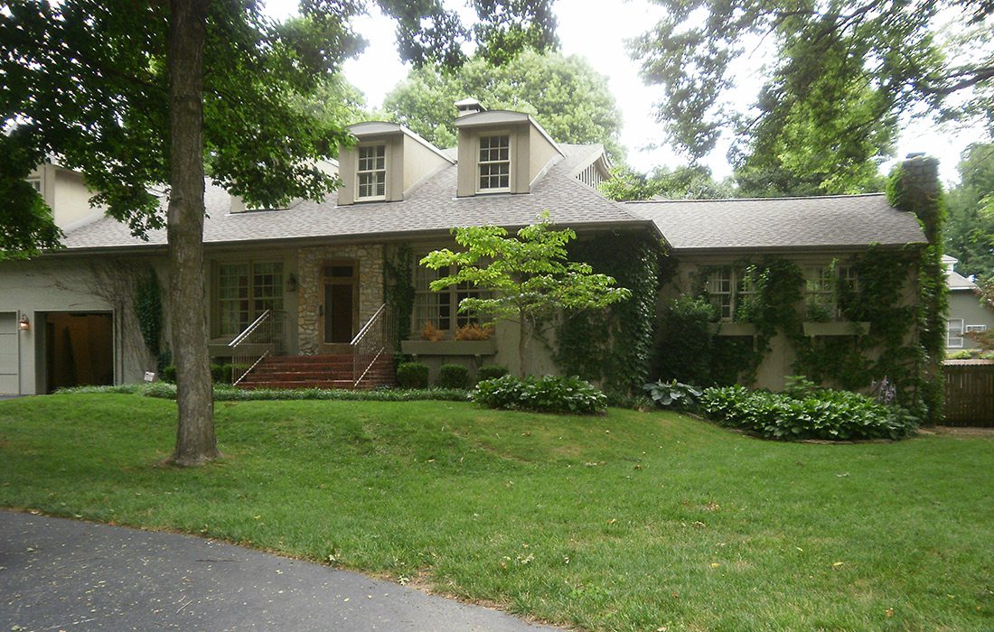
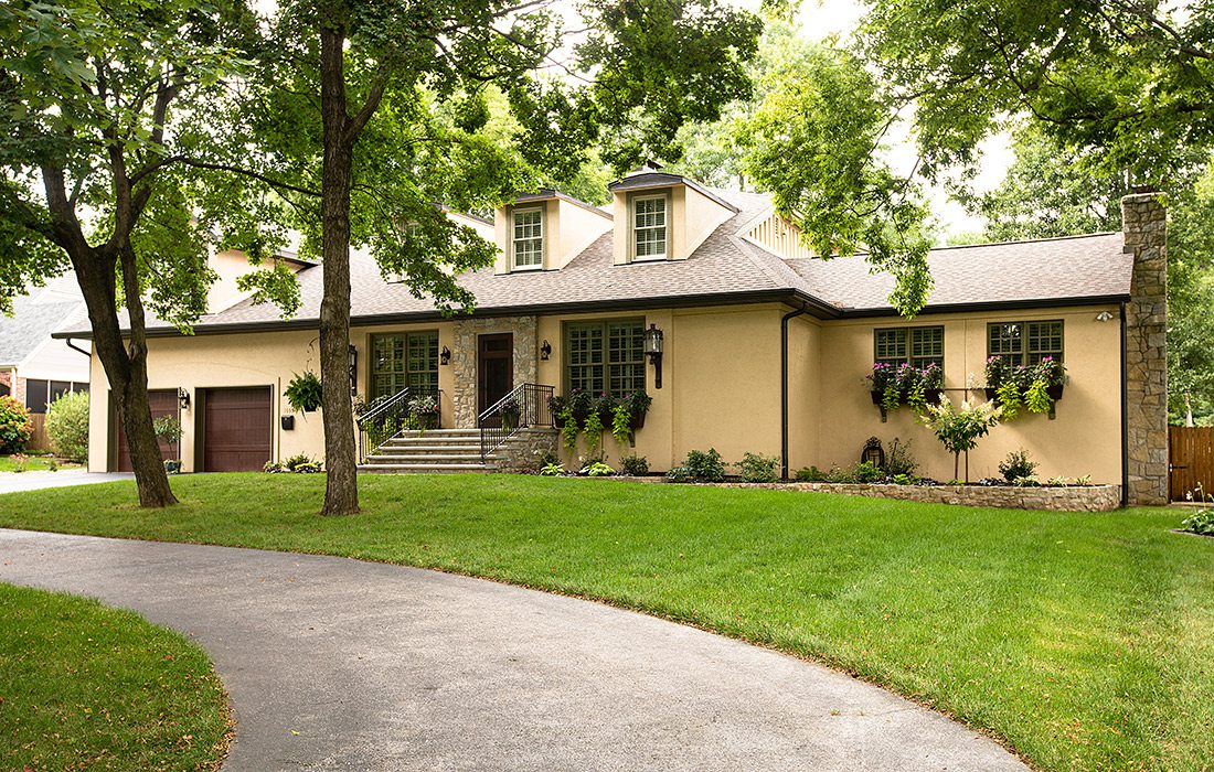
By the time Adrian Rhoads of Rhoads Design & Construction reached this 1946 abode, he wasn’t tasked with simply updating a deteriorating facade. Rhoads was instead responsible for unifying five-plus decades of additions and renovations and restoring the home’s interior and exterior. The facade needed some work: The window boxes were falling apart, the landscaping was begging for TLC, and the brick front steps and stone patio and walkway needed to be redone. “The original porch was scaled to the home’s 1940s layout,” he says. “We had to enlarge it to match the size of the current home.” All that stone work had to be torn out and chiseled down. The exterior was lightened up with a fresh coat of paint, and the garage doors were redone with a stain that played off of the rich tones used in the roof. The window boxes along the front of the house were replaced and stained to match the garage doors. For additional focal points, the homeowners provided reclaimed wall scones manufactured around the time the house was built, and the landscaping was redesigned by Vox Landscaping Design and installed by Elite Outdoor Innovations. By the time the project was complete, the home’s exterior matched its architectural character once again.
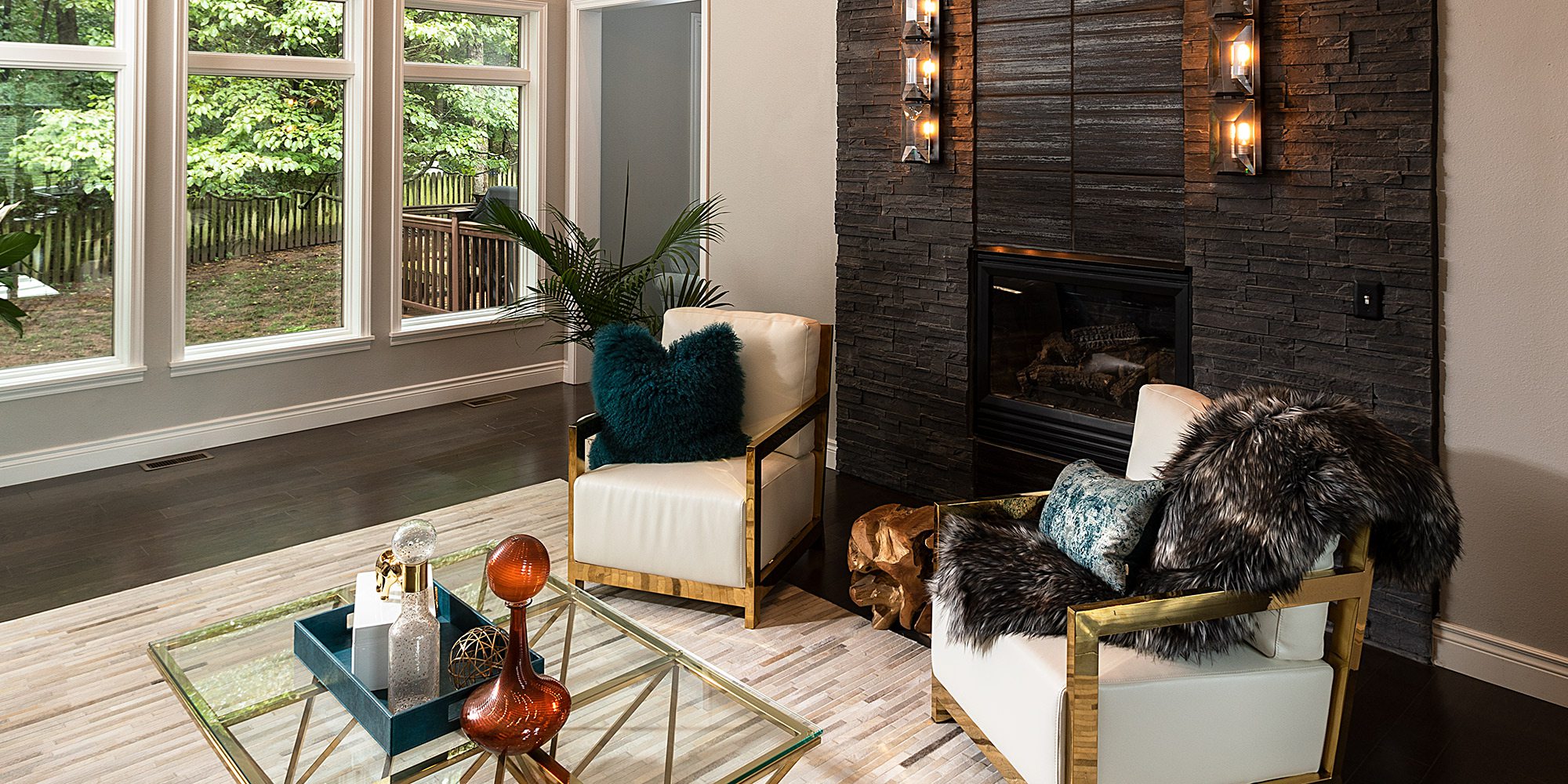
Living Room Remodel | Statement Fireplace
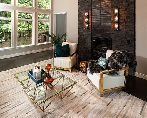
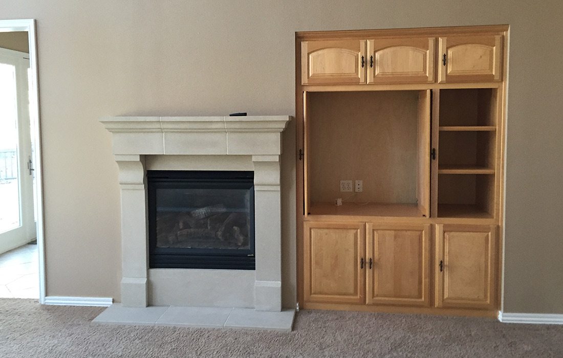
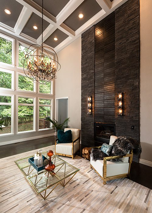
While most fireplaces serve as a focal point, this home’s fireplace was more of an eyesore. It was too small and too close to the living room doorframe, but interior designer and owner of Refine Studios, Charity Evans, had a vision of how to turn this outdated gas fireplace into a true centerpiece. With towering ceilings that brush the edge of 20 feet, Evans decided to give the fireplace height and drama to balance out the lofty ceilings. But first, the oak built-in shelving unit was removed, and the fireplace was moved to the center of the wall. Once everything was resurfaced and the original mantel and tile were removed, Evans got to work framing in the fireplace with black stone and a textured tile ribbon that matches the width of the fireplace and runs upward toward the ceiling. “The tile has a slight shimmer to it,” Evans says. That hint of glamor makes the fireplace slightly more formal, which was exactly what Evans was going for when she designed the upscale look that “dresses up” an otherwise unremarkable recessed fireplace.


