DIY
A Colorful DIY Fireplace Upgrade
A little paint and some colorful tile made this striking fireplace remodel easy peasy.
by Heather Kane Kohler
Jan 08 2021 at 8 a.m.
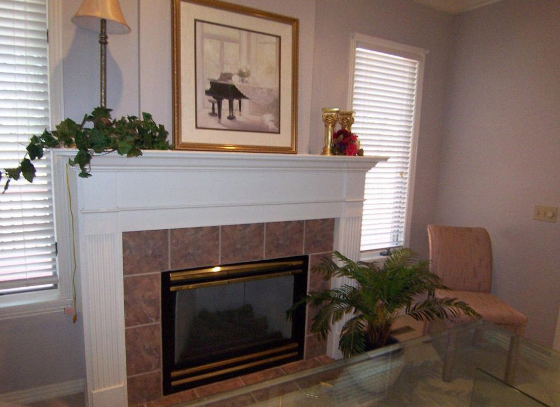
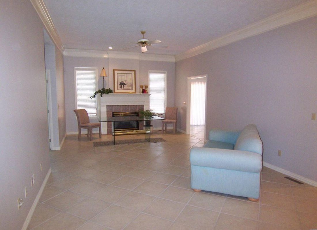
The fireplace is often the focal point of a room, and you can see by the before photo of my fireplace at the bottom of the page that the original fireplace was anything but a focal point. It was super dated and was screaming at me for a makeover! So naturally, I obliged.
Our living area has an open concept, something that many families really enjoy, however for me, open floor plans have one big problem. They lack coziness and tend to look very busy, which is a pet peeve of mine. This issue was something I was able to address in my D.I.Y. fireplace project, and I’m so happy I did. It made a world of difference!
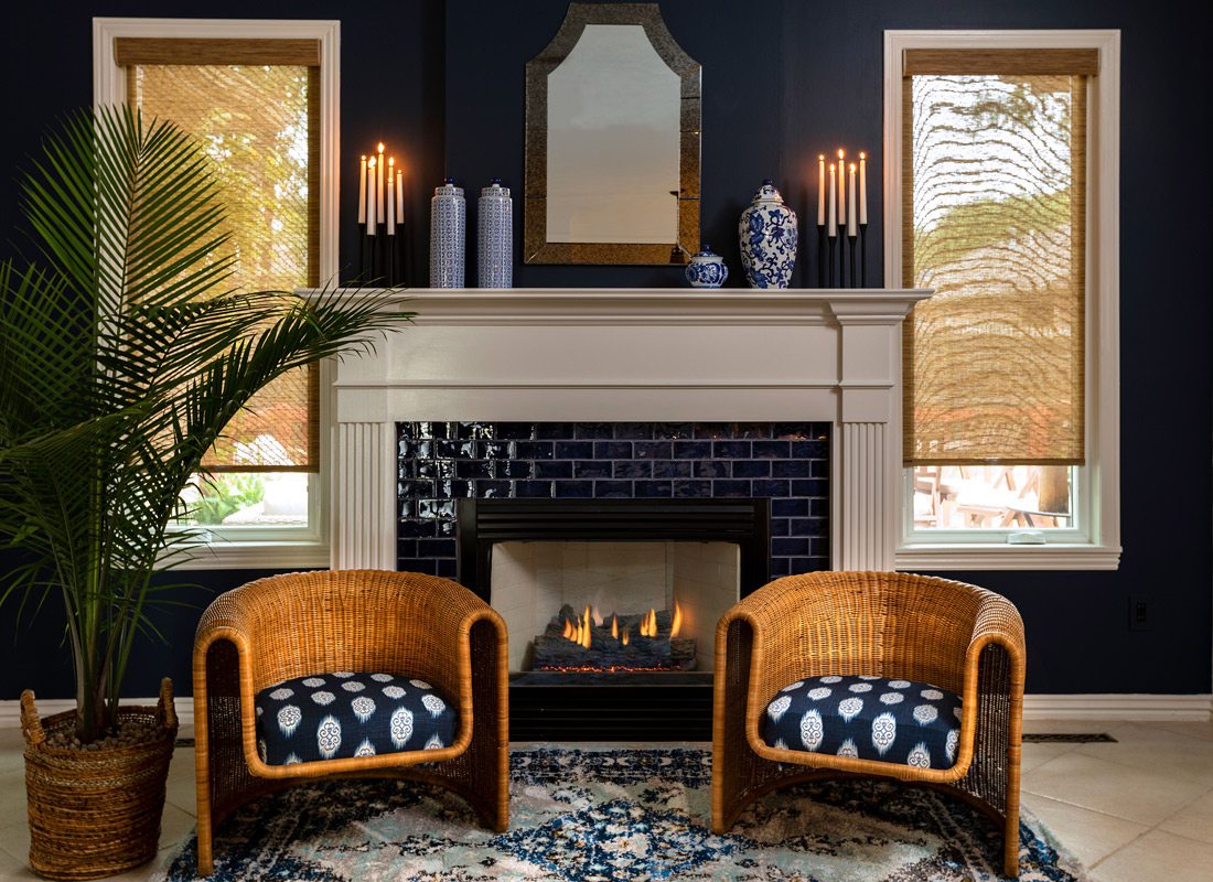
I started by painting the wall a striking color, (I chose Naval by Sherwin Williams). By doing this, I was able to frame out the white mantle, header and legs. This made it pop in the room and draw the eye right where I wanted it to go. For the tile I chose Lapis Cosmo tile by Winchester Tile Company from Missouri Tile. It was a very high-end tile, but because I was tiling such a small area, the overall cost was pretty affordable! You do want to make sure you get a tile that can withstand heat. Most tile is heat resistant, but you want to check with your retailer to confirm the tile you want can go around a fireplace.
Next, I had to choose a grout color. This part was harder than I thought it would be! You have to really think about your grout lines as part of your design. I was not looking for a lot of contrast in my tile design, so I chose a gray that was a little lighter than the tile. I was very happy I did this because it did not take away from my beautiful blue tile.
I decided to keep the styling of the fireplace very simple. By placing matching rattan chairs on each side, I played into the symmetry of the traditional design of the fireplace. A mirror that has low contrast and some chinsoerie completed my overall traditional look. The shades, (from Bloomin’ Blinds), made the look seem more contemporary, I always like to infuse other styles into my projects that have traditional bones. It keeps things interesting and personal. I couldn't be happier with how my D.I.Y. turned out. It’s perfectly cozy and makes a statement right when you walk through our front door. I’ll be curled up right here for the rest of winter if you need me! Take a look at some before and after photos below.


