Designers
Best Use of Space 2023 Winner
Take a look inside the Best Use of Space in the 2023 Design Awards.
by Jamie Thomas
Dec 2023
Winning Designer
Nathan Taylor, Obelisk Home
Project Goal
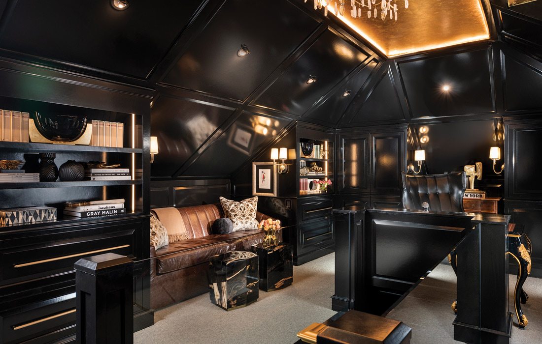
To take a small storage attic and create a private sanctuary inspired by the offices of Tommy Hilfiger in New York.
Who doesn’t want a secret room in their own home? Imagine pushing aside a panel and revealing a staircase that leads to a completely private space. Now imagine that space looking like a fashion designer’s office in a New York high-rise. That’s exactly what Nathan Taylor of Obelisk Home created in this property for a medical educator who needed a private home office but had extremely limited space to work with. The solution: Utilize attic space.
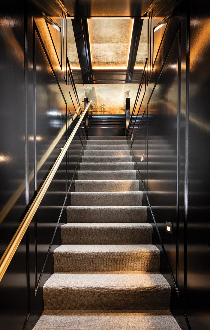
“It was just an attic,” says Taylor of what the space looked like before the work began. “It was literally a storage room, the stairwell had sheetrock walls going up both sides, it was very closed in.” The client brought in the inspiration of the Tommy Hilfiger offices in New York, and Taylor used this as a jumping off point for the renovation, building on the dark color palette.
While working in a limited space with dark colors risks making things feel more cluttered, Taylor describes how the materials—along with a few design innovations—helped avoid this pitfall. “The high gloss paint helps a lot,” says Taylor. “Second is the reflectivity on the ceiling, it makes it feel dimensional.” Taylor explains that the blue wallpaper in the small nook around the window is lit in a way to emphasize its brightness, while also having metallic flecks that help it blend with the rest of the reflective surfaces rather than clashing with the darker tones.
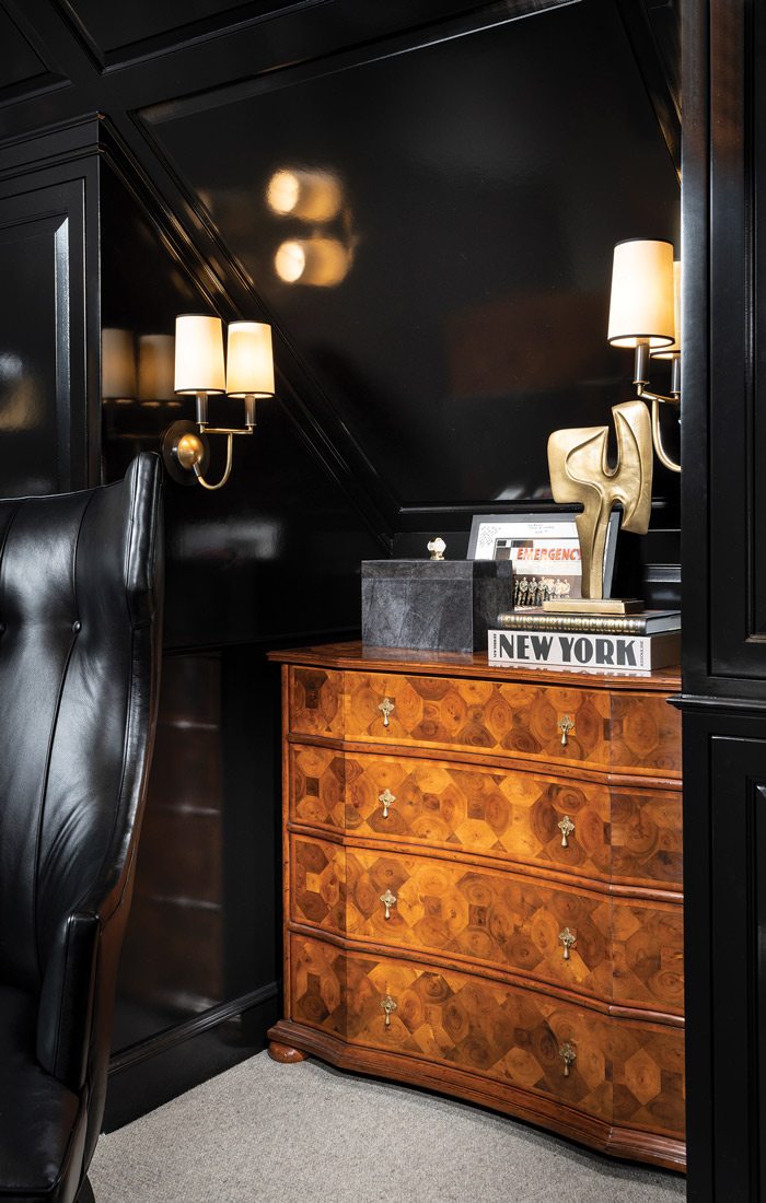
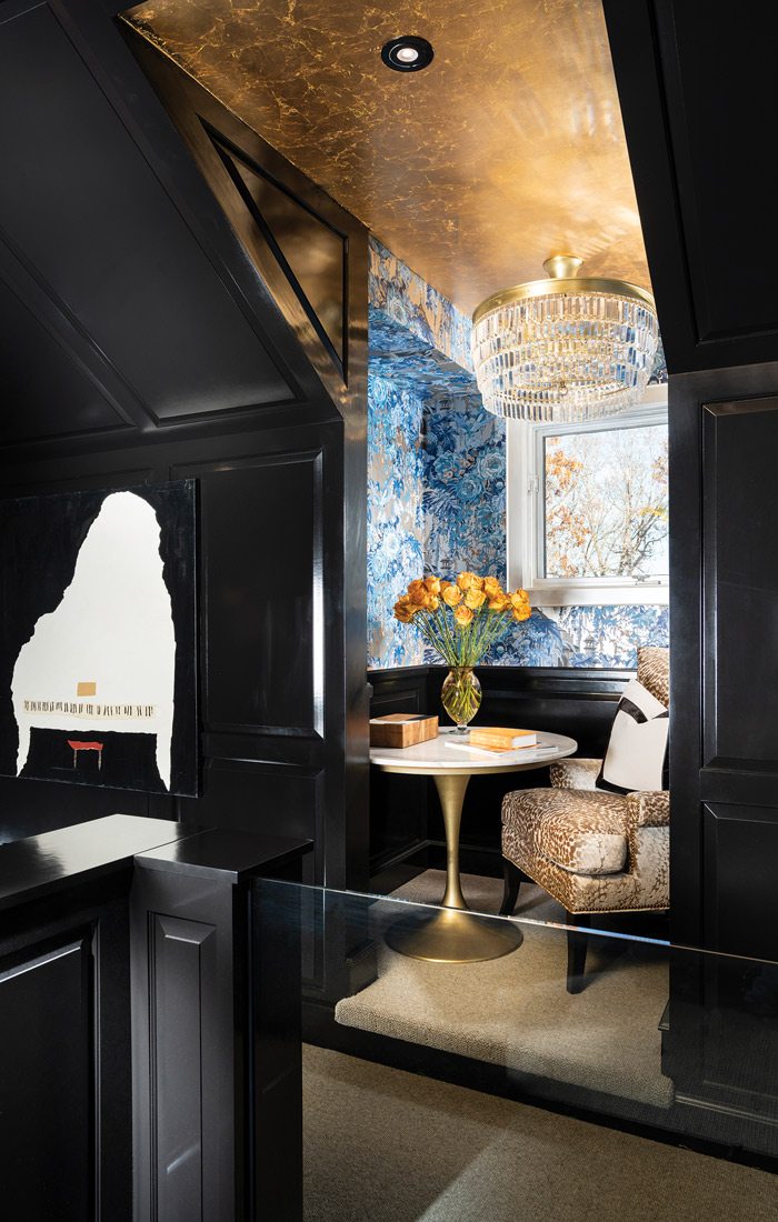
That small space was created as somewhere the client’s wife could sit and relax in the shared space while the husband was working. “He said, ‘My wife and I like to be together, so when I’m working I like her to sit near.’ So that’s where the idea came to put that little table in there and a big comfortable chair.” The blue floral wallpaper that accentuates the window was found by the homeowners in Portugal, and the Obelisk Home team tracked it down to use in the space.
Beyond the grand aesthetic of the renovated space, functionality was also key in Taylor’s redesign, with hideaway computer monitors and even a hidden bed in the drawers beneath the bookshelves for the couples recently born grandchild. “The drawers are about 42 inches deep,” says Taylor. “We put a trundle bed that glides completely open for a child to sleep up there, just really fun for a child to have a sleepover with grandpa.”
Even with the space repurposed and redesigned with hidden space, not to mention insulated from any noise in the rest of the property, the homeowners didn’t have to sacrifice all of their attic space. Behind a TV hides a hidden door leading to the rest of the attic. “It was difficult to figure out how to make that work,” says Taylor. “The TV is on an interesting pivot hinge and can move completely out of the way and you open up the attic with a small step ladder that you pull down and climb up.”
As for what the client thinks of the new space, Taylor says: “The husband has told me many times that it’s exactly what he wanted and he uses it like crazy.”
Furniture
Obelisk Home
214 W. Phelps Suite 101, Springfield
417-616-6488
Hardware and Counters
Cabinet Concepts by Design
4123 State Highway H, Springfield
417-725-3400
Wall Coverings
Obelisk Home
214 W. Phelps Suite 101, Springfield
417-616-6488


