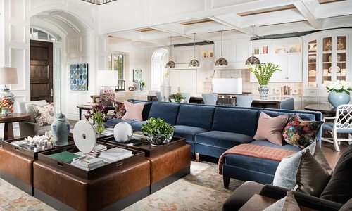
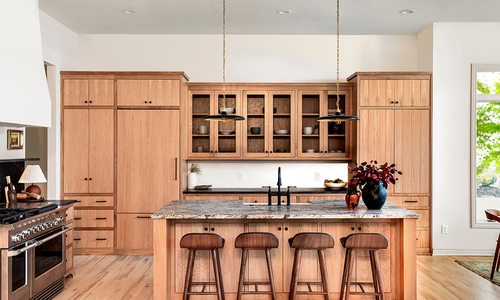
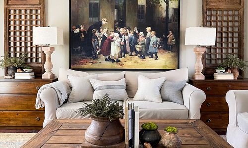
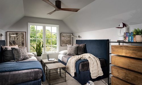
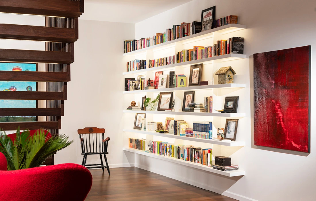
Taylor used the homeowner's large book collection as an accent piece of the home, drawing out pops of color and personal touches.
Home Profiles
Best Living Space 2023 Winner
For the winning living space, the designer set out to merge two contrasting personal styles in a multi-use walkout basement and to create separate sections where each family member could unwind.
by Tessa Cooper
Jun 2023
Winning Designer
Nathan Taylor, Obelisk Home
Project Goal Summary
To merge two contrasting personal styles in a multi-use walkout basement and to create separate sections where each family member could unwind.
Designing this walk out basement was a balancing act for Nathan Taylor, principal designer and owner at Obelisk Home. He knew this open space must cater to the R&R needs of a couple and their two daughters. Additionally, he wanted to combine the wife’s traditional taste with the husband’s contemporary taste.
The end result became three separate living spaces within one. The main seating area features a comfortable-yet-sleek oversized sectional and bold green leather chairs (pictured p. 57), while an antique replica rug anchors it all. Right behind this spot lies a secondary seating area, ideal for a fireside conversation and a cocktail conveniently made at the downstairs bar. The couple can lounge in the two pink chairs here while their two daughters watch a movie on the sectional.
A vibrant mural also adorns the adjoining wall next to the fireplace. “I knew we needed to add something over the top and really large scale because there were already a lot of small-scale pieces like art and family pictures everywhere.”
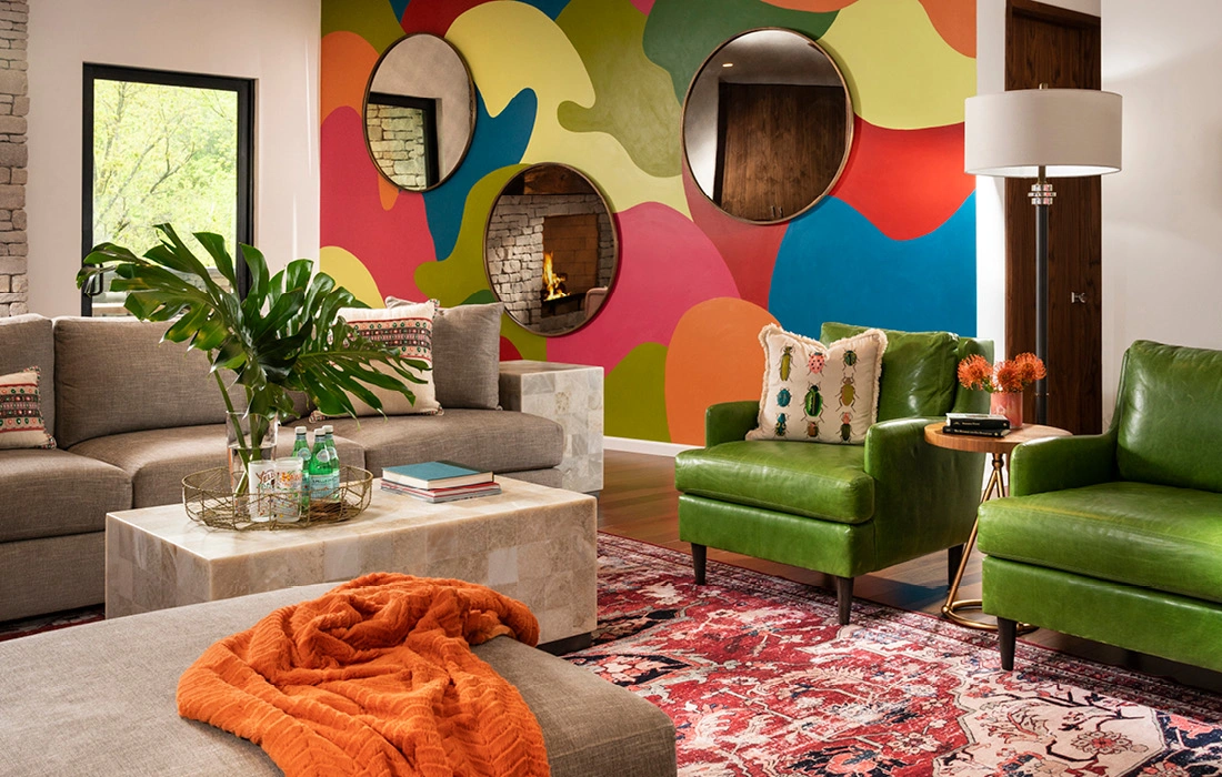
In this multi-use walkout basement, Taylor tied together each living space by using a similar but vast color scheme in each of the three sitting areas. Variants of orange, green, red, pink and yellow form a mosaic throughout.
Local artists Colby Kern and Christie Snelson drew the outline and painted the majority of the mural and Taylor selected the colors. However, each family member assisted some in the painting process, making it a truly sentimental work of art. Three large round mirrors hung on the mural reflect the other sitting areas, creating a sense of cohesion and connectedness as the family spends time alone, but together. “The three circular mirrors add another shape and reflectivity,” Taylor says. “I wanted something that would kind of catch the outside inside and from all different directions.”
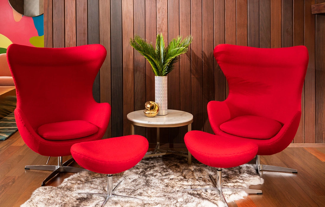
Underneath the stairwell provided a perfect place for a reading nook, complete with a couple of cherry-hued chairs that are equal parts stylish and cozy. The two daughters often stake this spot as theirs and love to curl up with books selected from the family’s library that sits conveniently across the way.
“One of the things I always tell my team is that we’re storytellers,” Taylor says. “[This room] is a book and each corner is a different chapter, but they are all relatable.”
RESOURCES
Builder, Moldings, Audio
Aaron King at Cutting Edge Homes
2115 E. Mimosa St., Springfield, 417-861-8656
Home Layout Design
Cody Donastasio, Principal at Arkifex Studios
221 South Ave., Springfield, 417-773-1605
Custom Mural
Christie Snelson and Colby Kern at Obelisk Home
214 West Phelps, Suite 101, Springfield, 417-616-6488
Lights and Electric
Todd McQueen Electric
Springfield, MO, 417-880-6513
Furniture
Obelisk Home
214 West Phelps, Suite 101, Springfield, 417-616-6488
Artwork
Obelisk Home
214 West Phelps, Suite 101, Springfield, 417-616-6488


