Home Profiles
Best Kitchen 2023 Winner
The goal of this winning project was to completely overhaul a 1950s galley kitchen, update it with the homeowners’ personal style and add ample storage and lighting while leaving enough room for a kitchen island.
by Tessa Cooper
Jun 2023
Winning Designer
Toni Echols, Obelisk Home
Project Goal Summary
To completely overhaul a 1950s galley kitchen, update it with the homeowners’ personal style and add ample storage and lighting while leaving enough room for a kitchen island.
After living in her home for close to a decade and working as an assistant designer and project manager with Obelisk Home for a handful of years, the time finally came for Toni Echols to work on a very special space: her own kitchen.
“The kitchen was original from the 1950s, and not in a good way,” Echols says. “The goal was to fully update it aesthetically and function-wise. I needed all-new everything because there was nothing in the kitchen that was worth keeping.”
A kitchen island was high on her wishlist. With a small footprint, fitting an island in this galley kitchen while still maintaining enough walking space wasn’t an easy feat. However, she was able to make it work by choosing a long and narrow one and by putting her own spin on the golden triangle design rule.
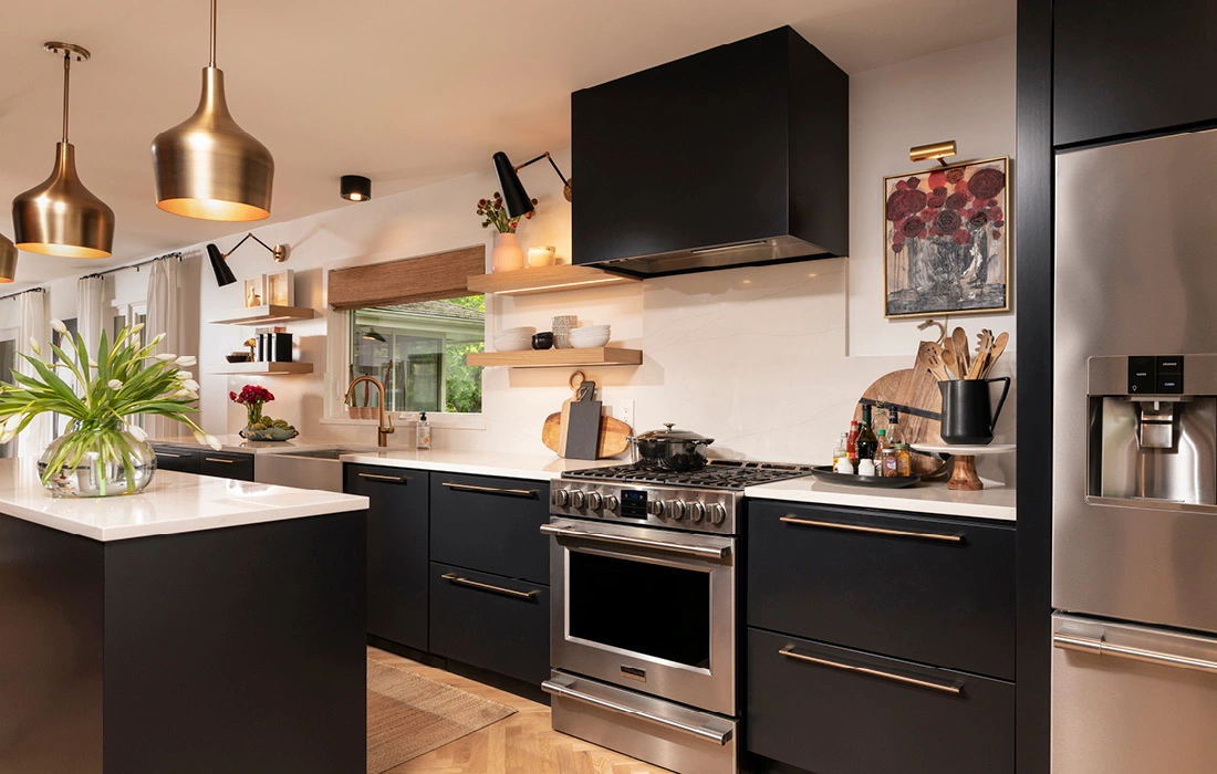
This kitchen design theory suggests that the position of your oven, fridge and sink should form a triangle shape to create an efficient workspace. In her kitchen, Echols positioned these appliances in close proximity to one another in a straight line and situated the kitchen island across from these features to complete the triangle.
In terms of the design direction, she knew she wanted to honor the midcentury nature of her home but at the same time wanted to add in some modern and fun touches.
The counter material she landed on was Calacatta Clara quartz, which she values for its stain resistance, durability and overall look. “It’s got a really subtle veining,” she says. “It’s not just solid white, but it’s not busy at all. Some types of quartz can be a little too busy without looking like the original.”
For a slight lean into the midcentury modern look, she chose slab front cabinets in Tricorn Black by Sherwin Williams, which is a true black paint with no blue or brown undertones. She went with this color because she knew it would be a bold neutral that wouldn’t compete with her grand plans for a colorful mural.
A couple of her closest friends and local artists, Colby Kern and Christie Snelson, painted the mural nestled between the two display cabinets. “When I asked them if they would consider the mural, it was an immediate yes,” she says. “They were so happy that I wanted to do something wild. My favorite feature of this kitchen is 100% this mural.”
RESOURCES
Cabinets and Cabinet Hardware
Concepts by Design
4123 N. State Hwy. H, Springfield, 417-725-3400
Wood Floors
Canales Wood Floors
731 W. Rivendale Dr., Springfield, 417-827-2055
Framing and Windows
Chris Treese at Classic Home Concepts
2424 S. Campbell Ave., 417-553-2778
Drywall and Paint
Fortitude Building & Development
Springfield, MO, 417-988-6300
Custom Mural
Christie Snelson and Colby Kern at Obelisk Home
214 West Phelps, Suite 101, Springfield, 417-616-6488
Lights
Obelisk Home
214 West Phelps, Suite 101, Springfield, 417-616-6488
Furniture
Obelisk Home
214 West Phelps, Suite 101, Springfield, 417-616-6488
Appliances
Metro Appliances & More
3252 N. Glenstone Ave., Suite B-100, Springfield, 417-833-1113


