Home Profiles
Best Use of Color
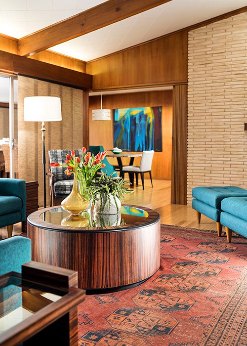
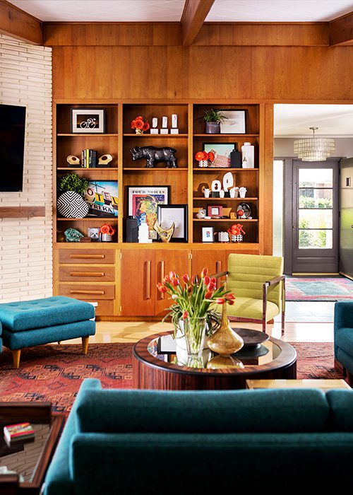
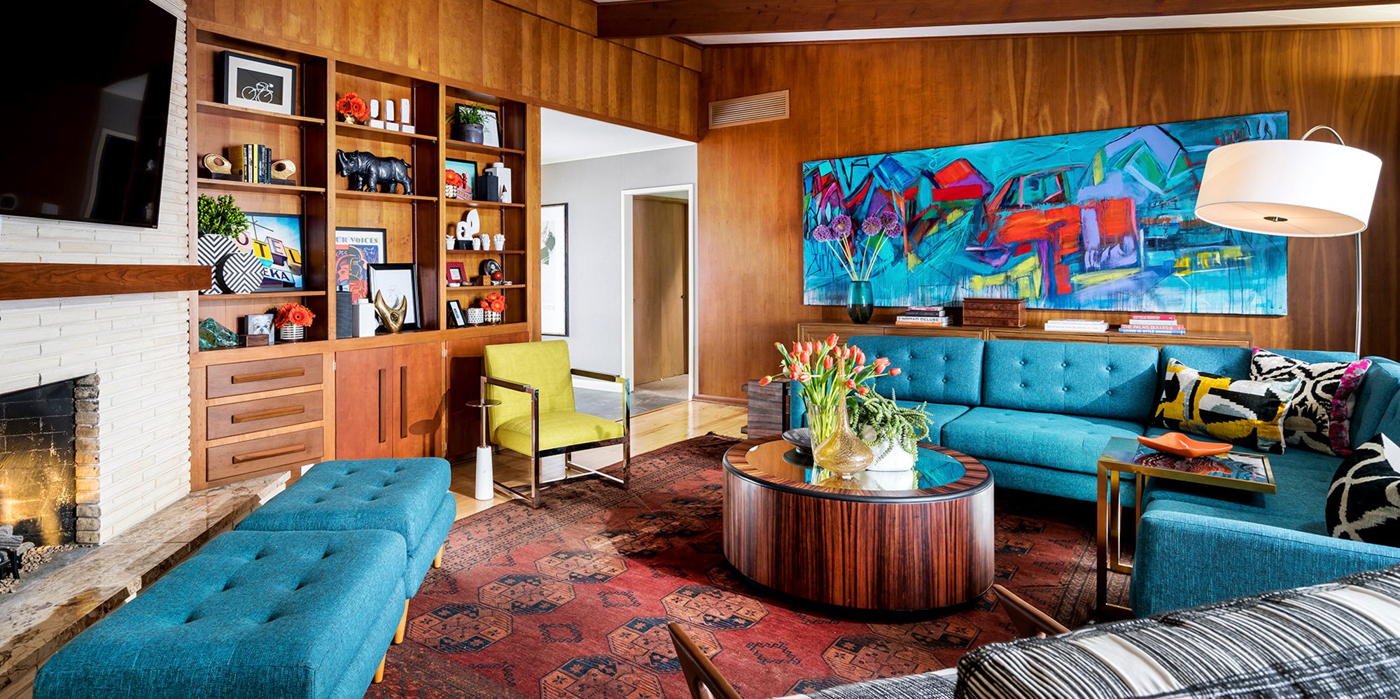
Nathan Taylor of Obelisk Home worked with the homeowners of this midcentury home to create a living room space that was respectful of the era in which it was built, but also incorporated modern touches and comforts.
By Briley Rakow
Sep 2020
WINNING DESIGNER: Nathan Taylor, Obelisk Home
PROJECT GOAL: A room with limited space and limited ability to make use of modern appliances needed to be updated to something more inviting, without sacrificing the property’s history but also not making it look old-fashioned. With some extra creative design tactics, the room became a chic, colorful and cozy social space.
“I actually met this client at the Home Builders Association home show,” says Nathan Taylor of Obelisk Home. “She invited me into her home and in that room, the only thing she had was the turquoise sectional. The back of the sofa was [facing] the fireplace and I said ‘I think we need to flip-flop this room around, and she said ‘I don’t think we can do that’.” With this space, Taylor was able to get creative with patterns and placement to create an intimate-yet-roomy spot in a property that was built in the 1950s.
Building on the sectional that still sits in the re-designed room, Taylor took to crafting a retro-tinged room that has modern sensibilities and appliances and still retains stylistic midcentury modern elements. “Over-modernizing it was exactly what we didn’t want to do,” Taylor says.
Although the style was influenced by the era in which the property was built, some modernizing of the space was essential. “We couldn’t get power or cables to the TV unless we added a mantel,” Taylor says. “We even got the original blueprints to the home and tried to find a way to get electricity to this area and we just couldn’t do it. That’s where I came up with the asymmetrical mantel [...] so that we could bring all the power and put the TV above the fireplace, then we were able to flip-flop the room and add more seating areas. The room almost doubled in size because of the angle of the wall.” In place of where the TV had originally been mounted, Taylor hung a painting by artist Betty Parnell. The painting serves almost as a centerpiece, according to Taylor, immediately drawing the eye with bold colors and abstract patterns that accent the variety of tones that now fill the space.
“We put in this antique Persian rug, which was a gift to her from a friend,” Taylor continues. “That was the impetus for mixing in some other aged pieces to not be so purely midcentury modern. We brought in some of the other pieces, like two of the accent chairs, as an ode to contemporary-to-midcentury [style], but then we added more color. We added the black and white pattern on the chair, the green on the little accent chair.”
Despite the detail and variety of color, Taylor arranged the furniture in the room to maintain a flow of foot traffic. “I’ve been to parties in that home because I’m friends with the owner now,” Taylor says. “We’ve had 15 people in that room comfortably.”
RESOURCE LISTINGS
Where to find the looks and materials used to create this winning home design in Springfield, Missouri and surrounding areas.Monticello Custom Homes & Remodeling
Wired


