Home Profiles
Most Creative Use of Materials in a Kitchen
Nathan Taylor of Obelisk Home helped a southwest Missouri couple achieve the open kitchen concept of their dreams while merging functionality and elegance through the strategic use of materials.
By Jennifer Adamson
Jun 2019
WINNING DESIGNER: Nathan Taylor, Obelisk Home
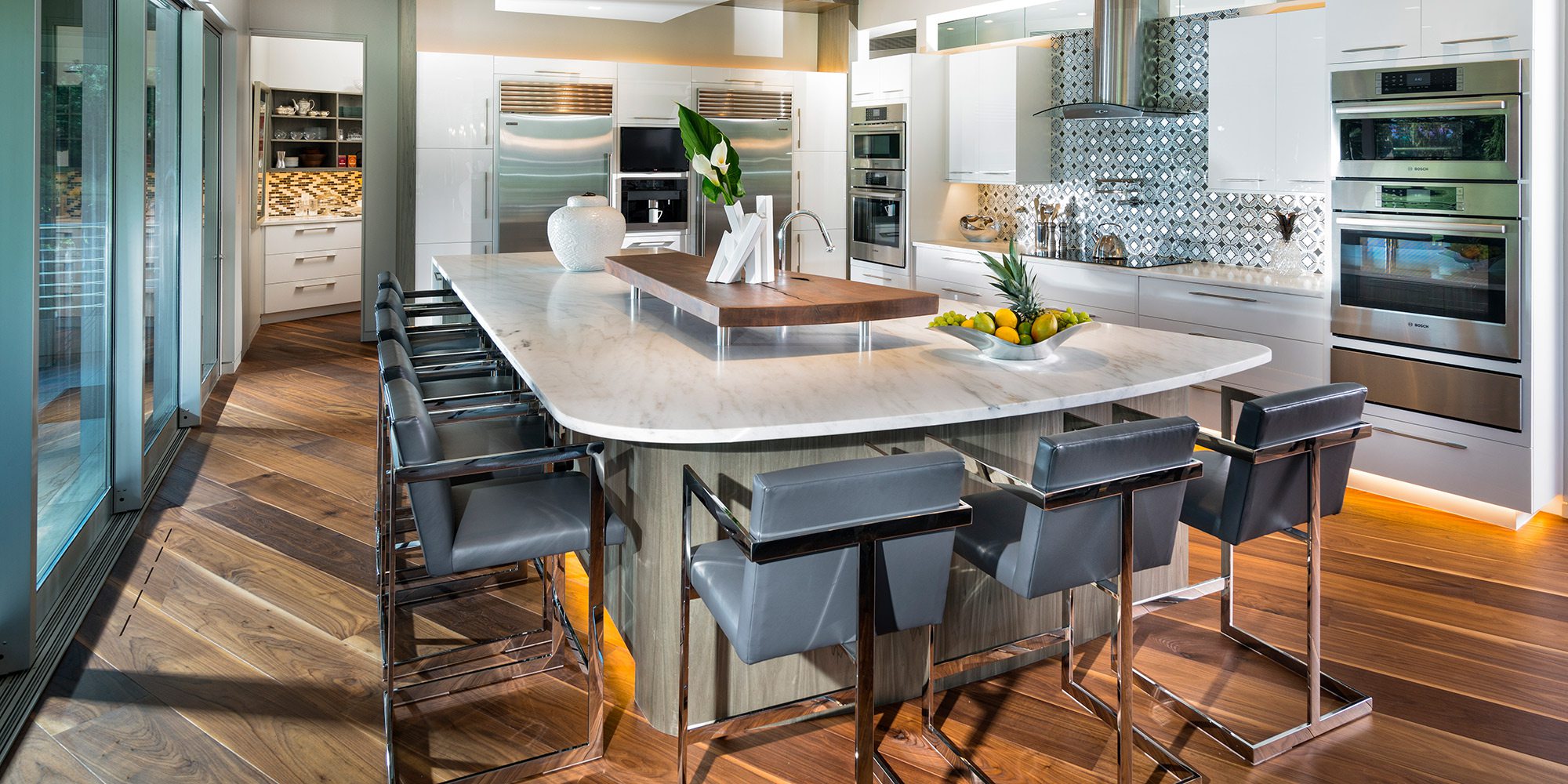
PROJECT GOAL: In this open kitchen, the intent was to merge functionality and elegance to mimic the stylish appearance of the adjoining living area. A custom island with hidden storage and gorgeous organic elements brought the designer’s vision to life.
This welcoming kitchen is the perfect example of what carte blanche enables a designer to accomplish. It also helps that the project lead and co-founder of Obelisk Home, Nathan Taylor, was involved from the start of this home’s construction, meaning he could brainstorm with the homeowners exactly what they envisioned for their space before walls went up. That’s why there are no walls—only glass pocket doors—between the kitchen and patio. One of their priorities was a seamless transition between indoor and outdoor entertaining.
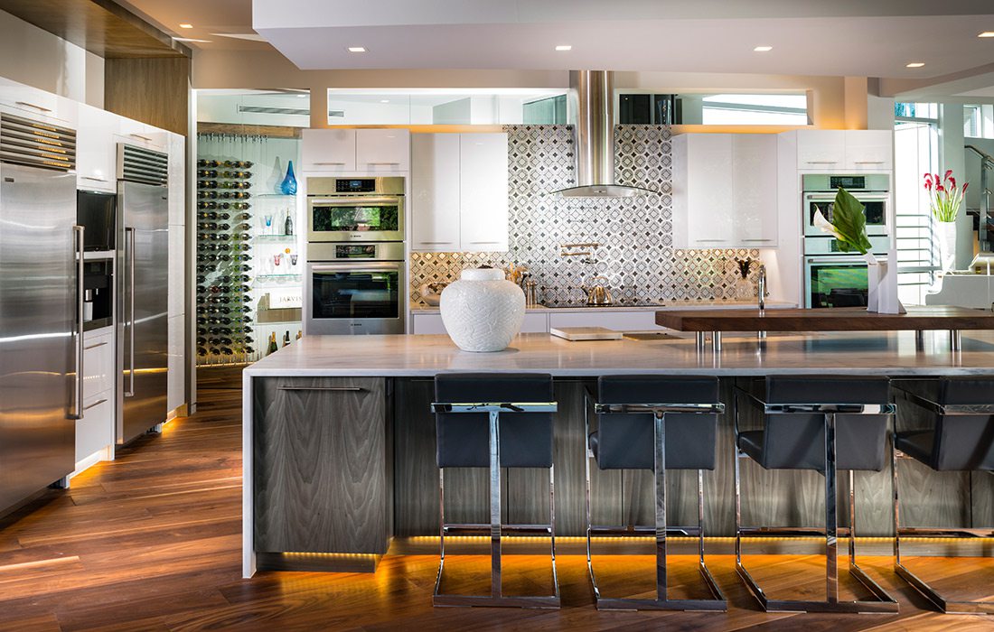
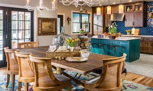
The couple also requested an island expansive enough to set up a buffet line on one side and still have seating adjacent. Danby marble was chosen for its elegance, sturdiness and ability to resist dinner-party stains. The island was further customized with hidden storage at the end for conveniently stowing patio necessities.
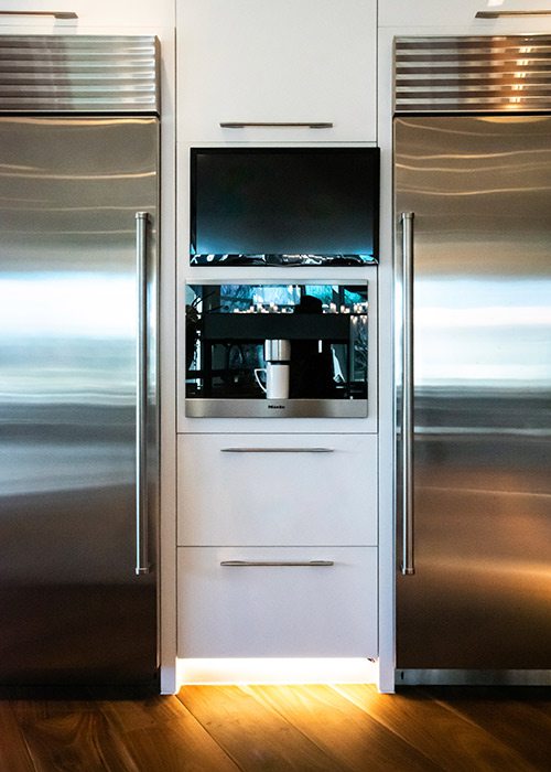
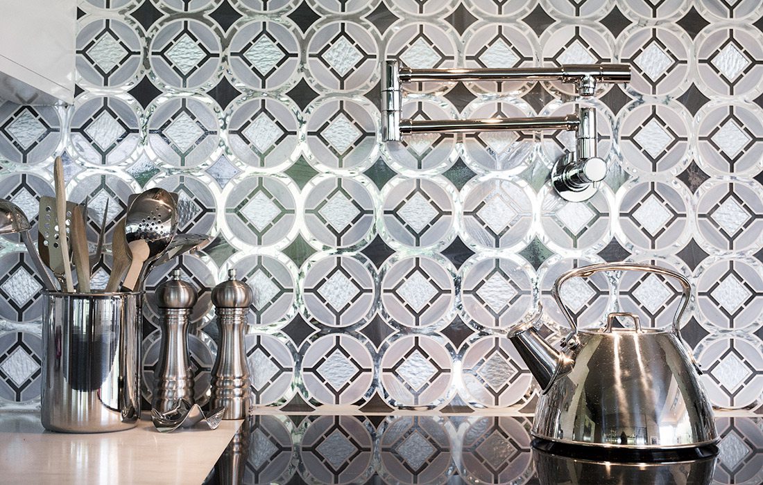
Another non-negotiable was balance. Notice how the fridge and freezer flank a built-in espresso bar and how the range is midway between two sets of cabinets, warming drawers and ovens. There’s symmetry in the backsplash, too—made of mirrors and glass to play off the reflectivity of the white acrylic, soften the look comprehensively and serve as a work of art.
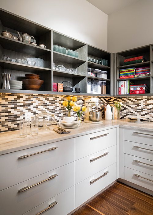
To prevent the light and bright design from appearing sterile, natural elements and warm tones were incorporated throughout, including exotic wood veneers on the drawer fronts, a walnut centerpiece atop the island and walnut floors that extend into the pantry. With a second sink and extra storage, the behind-the-scenes area is utilitarian but still beautiful.
“They wanted the kitchen to function, but, because it’s open to the entire main living area, they wanted it to have an elegance to it,” says Taylor, who accomplished just that.

