Home Profiles
Most Creative Use of Materials in a Bathroom
Craving a midcentury modern feel to match the rest of the home, the homeowners of this bathroom enlisted the help of Nathan Taylor of Obelisk Home to help them achieve a fresh design in a modest space.
By Jennifer Adamson
Jun 2019
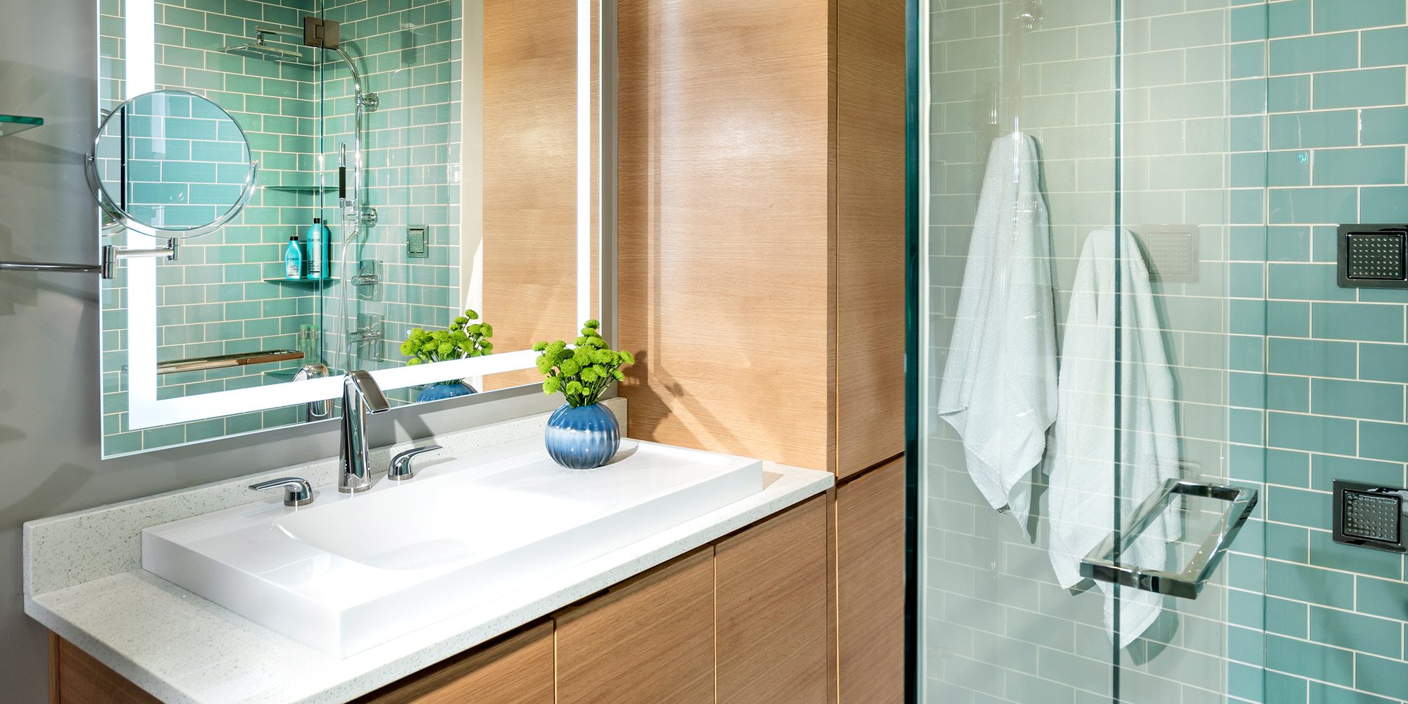
WINNING DESIGNER: Nathan Taylor, Obelisk Home
PROJECT GOAL: The owner of this master bathroom wanted it to look and feel as fabulous as the rest of her midcentury home but with a fairly modest footprint, so using materials creatively became necessary in proving a small space can still have a big impact.
At the time this Springfield bathroom was built decades ago, mint green tile stretching across the floor and halfway up the walls was on-trend. By today’s standards, the dated style demanded salvation. But renovation wasn’t just aesthetically necessary. The space needed to accommodate a modern-day lifestyle.
“We now want to build how we live instead of functioning in what we were given,” says Nathan Taylor, co-founder and principal designer of Obelisk Home. “The bathroom did function, but there was a ton of wasted space.”
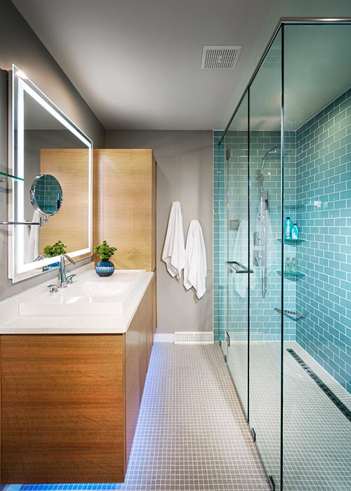
At the top of the homeowner’s wish list was a big, bright walk-in shower, a stark contrast from the compact, dingy one she had used for years. With limited square footage, the only way to fulfill her request was to lessen the standard distance between it and the sink. But with such a gorgeous result, the compromise is unnoticeable.
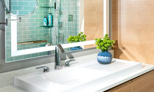
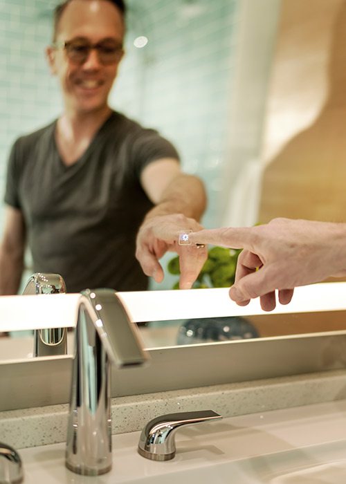
Adjacent to the shower, a new floating vanity was installed along with an innovative mirror able to cast even light in three distinct brilliances. The homeowner just has to push a sensor to adjust the output. The toilet is also a technological wonder, performing numerous functions at the user’s whim.
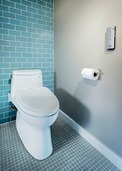
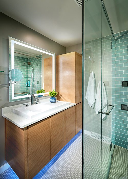
These features, plus glass tiles in the shower, recycled-glass countertops and mosaic flooring, embody a serene color palette reminiscent of the sea, which visually enlarges the space and beckons in the homeowner. Now, going to the loo is less a chore and more about decor.


