Home Profiles
Best Use of Color in a Kitchen
Combining two different styles is not an easy feat, but Jeremiah Lee and Susie Edie of Rock Solid Renovations helped these local homeowners create a kitchen that spoke to their love of elegance and natural elements.
By Jennifer Adamson
Jun 2019
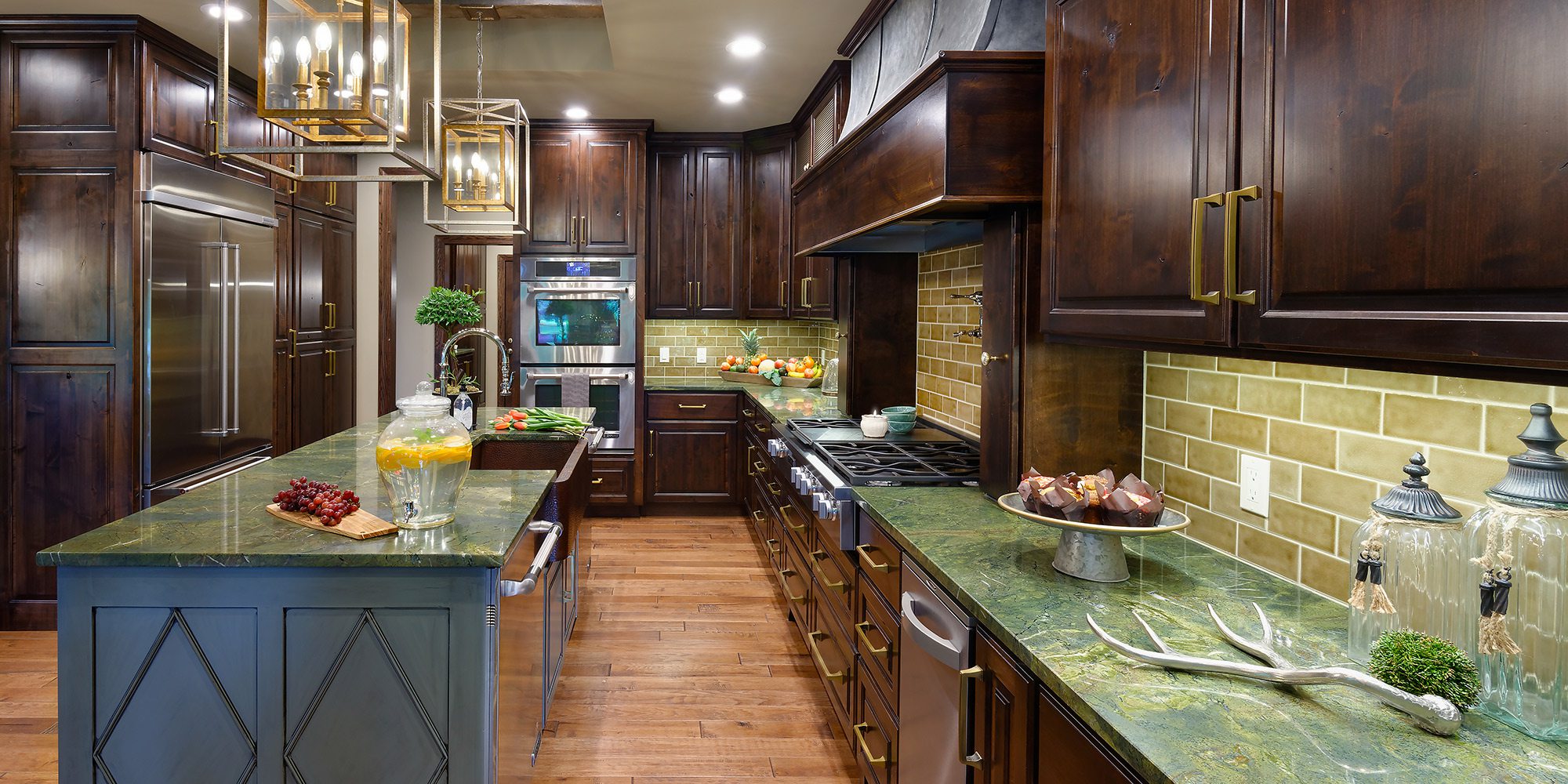
WINNING DESIGNER: Jeremiah Lee & Susie Edie, Rock Solid Renovations
PROJECT GOAL: The homeowners wanted a space that mixed both their personalities, so the designer combined elegance with natural elements to create a look as beautiful as it is functional.
(Editor's note: This winning design tied for Best Use of Color in a Single Room with a design by Nathan Taylor.)
After enduring another stressful holiday season in a kitchen their family had outgrown, the owners of this eclectic space knew they needed to make a change. They also knew the person in charge of the renovation would face the challenge of combining their contrasting styles, so they decided to rehire Susie Edie, an interior designer with Rock Solid Renovations.
“We had done a bathroom for them about a year prior, so I had a little experience working with them,” Edie says. “She’s very open to ideas. With her, I can get a little more creative.”
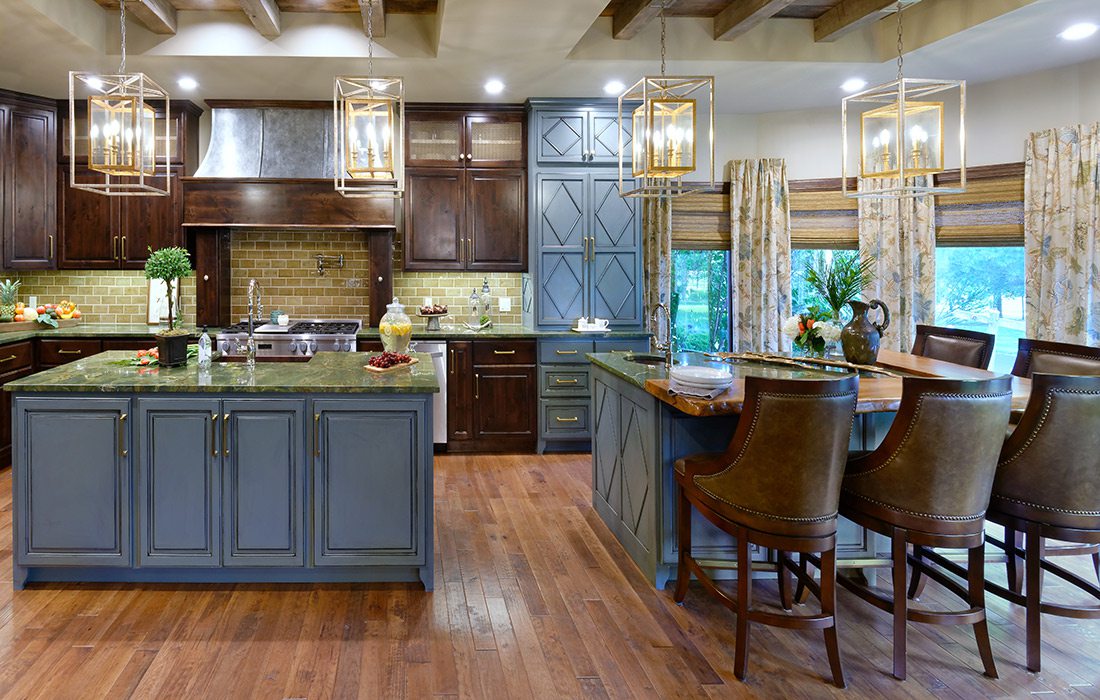
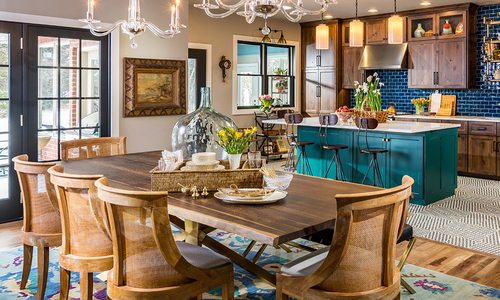
Eager to dive in again, Edie learned the homeowners’ vision for the project, which quickly grew from a single-room remodel to an open-concept plan, improving flow between the kitchen, dining room and living area, and providing more usable square footage. The entire kitchen was gutted, with the exception of original wood floors in the breakfast nook, later used to match new flooring throughout the kitchen.
Custom cabinetry was installed, including a floor-to-ceiling cabinet to the right of the stove to conceal the coffee maker and microwave. Other non-negotiable amenities include an additional island with an extra sink, more storage and overflow seating, plus an enlarged pantry, upgraded refrigerator and second dishwasher.
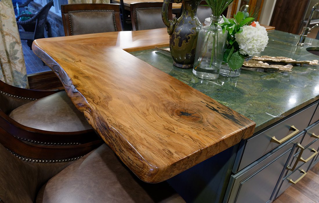
When the general design was complete, Edie turned her attention to finishes and textures, considering how she would reconcile cravings for masculine, rustic elements and feminine elegance. First, she chose a handsome green granite to complement a copper sink that was at the top of the couple’s wish list. The countertops then inspired a color palette of hues from nature. By pairing a spalted sycamore live-edge bar and reclaimed barn wood with mixed metallics found in hardware, lighting and the range hood, Edie achieved a look both homeowners love. Floral-patterned window treatments and woven shades were the final touches.
“Being able to use such a variety of different finishes and materials made the overall project so dynamic,” Edie says.

