Home Profiles
Best Bedroom Design
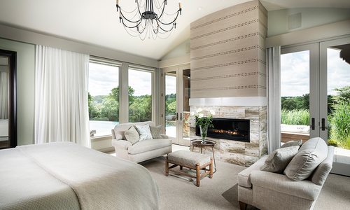
In a space that was starved for natural light, Nathan Taylor of Obelisk Home helped the homeowners of this bedroom create a light, airy and comfortable space.
By Jennifer Adamson
Jun 2019
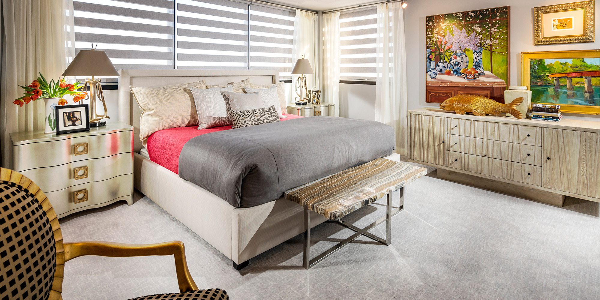
WINNING DESIGNER: Nathan Taylor, Obelisk Home
PROJECT GOAL: A lack of natural light in this formerly dreary bedroom was a letdown for the homeowners. Unable to change the structure of the windows, creating the appearance of height and making the space as bright as possible was the goal.
This bedroom in central Springfield used to be a dark and uninviting place where not even the homeowners wanted to spend time. The walls and carpet were standard beige, the baseboards were boring, and shallow windows prevented the intrusion of much natural light, which caused unnecessary shadows and accentuated the plainness.
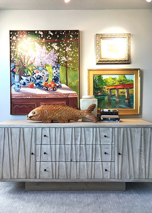
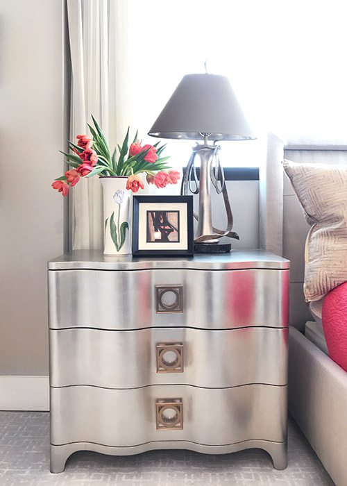
Interior designer Nathan Taylor saw this as an opportunity rather than misfortune. After discussing with the homeowners what features were important to them, the co-founder of Obelisk Home decided to use their colorful art collection as a jumping-off point for a revamp.
“We wanted to create the feeling of height and elegance without sacrificing any wall space to accommodate art,” Taylor says. A fresh coat of paint and new carpet in the same understated hue established a neutral backdrop; baseboards measuring a trendy 6 inches wide replaced old, more traditional ones; and the lighting situation was addressed. Without the option to install bigger windows, the only solution was to prevent existing light from being blocked. This was accomplished using floor-to-ceiling sheer curtains, motorized shades and a bed frame that barely extends past the window sill. Monorail lighting was added above the dresser.
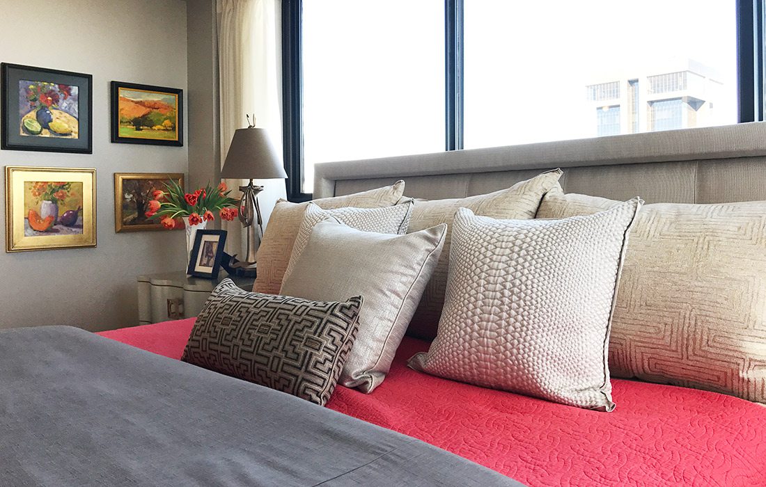
With the exception of the furniture, the rest of the look was curated using pieces the couple already owned. The amalgamation of organic and glamorous represents their different personalities and tastes, as well as how multiple textures boost the visual dimension of otherwise static design.


