Home Profiles
Best Single-Room Remodel
Gina McMurtrey of Gina McMurtrey Interiors helped two young homeowners elevate the design of their master bathroom to match the level of sophistication of their master bedroom.
By Jennifer Adamson
Jun 2019
WINNING DESIGNER: Gina McMurtrey, Gina McMurtrey Interiors
PROJECT GOAL: The style of this bathroom needed to match the adjoining bedroom and be more reflective of the young homeowners’ ages and interests. Enlarging the room’s footprint wasn’t an option, so improving visual space was the priority. This was achieved through the use of light, glass and a monochromatic color scheme.
Looking at this stunning bathroom, you would never know the obstacles interior designer Gina McMurtrey had to overcome to give these homeowners the bright and functional spa-like retreat they requested. But as the owner of Gina McMurtrey Interiors, she thrives on problem solving when it comes to designing around awkward spaces. She always moves forward with confidence knowing the solution is in the details.
“There were a lot of really weird aspects to that room,” she says. “It’s L-shaped, so there’s an angled wall next to the door and a tight space between the shower and bathtub that they didn’t make use of. It wasn’t financially feasible to change the square footage, but we could do a lot to make it look larger than it actually is.”
The first step in bringing the 120-square-foot bathroom to life was to remove all existing features. With a clean slate, McMurtrey was able to map out how to visually broaden the room while using materials that look luxurious but don’t break the bank.
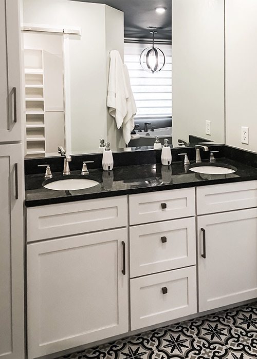
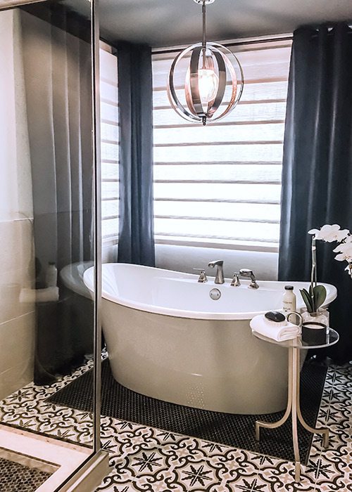
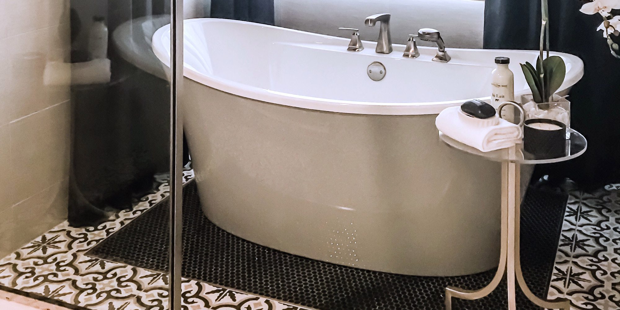
She replaced an acrylic shower insert with a semi-frameless glass enclosure to keep sight lines unbroken, brought in a stand-alone tub with deck-mounted faucet to accentuate a minimalist aesthetic and installed a custom dual vanity and linen closet for convenience and improved storage. Worn ceramic flooring was traded out for Moroccan-style tile that boldly meanders through the space, while the area surrounding the tub and shower were inlaid with a linen textile-type black penny tile to complement the black-and-white pattern.
Dim lighting also needed to be addressed. McMurtrey’s fix was to install mirror-mounted bulbs above the vanity and a modern chandelier above the tub, which casts a beautiful reflection on the dark gray ceiling. She also put new lighting throughout on dimmers, giving the homeowners the option to go relaxed and romantic or fully intense and utilitarian. A pair of uneven corner windows was disguised with white woven-wood hobble shades and black grommeted drapes—another cost-saving technique. But with so much brightness, daylight is not missed.
“There were some distinct boundaries and limitations to what we could and could not do in this space,” says McMurtrey. “In order to give them all the important aesthetic aspects and stay in their budget, we needed to make some compromises, but you don’t notice they were compromises.”


